MB Picture House Two Bold
Display / Art DecoDesigned by Ben Mitchell (M-B Creative)

Designed by Dino dos Santos
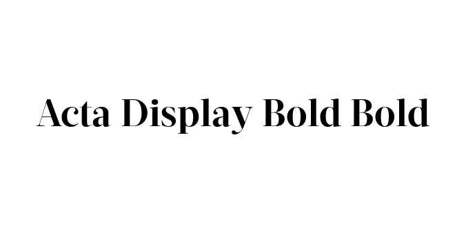
| Font Name | Acta Display Bold |
| Style | Bold |
| Category | Serif |
| Designer | Dino dos Santos |
| Copyright | Copyright (c) 2010 by Dino dos Santos _DSType. All rights reserved. |
| License | Free for Personal Use |
| Total Character | 433 |
| Recommended Line Height | 1.19 |
| Ascent | 928 |
| Descent | 261 |
| Units Per em | 1000 |
| Total Vertical Range | 1189 |
| Max Advance Width | 1237 |
| Max Advance Height | N/A |
| Underline Position | -75 |
| Similar Fonts | Didot, Bodoni, Caslon Graphic, Chronicle Display |
Acta Display Bold was originally designed by the renowned Portuguese type designer Dino dos Santos in 2011. It was part of a broader typographic system commissioned for the Chilean newspaper La Tercera. The Acta family was built to provide a versatile solution for editorial environments, ranging from dense news text to high-impact display headlines.
The Display version of the Acta family is characterized by its extreme stroke contrast and sharp, refined serifs. The Bold weight specifically offers a powerful presence on the page, making it a favorite for fashion editorials, luxury branding, and sophisticated advertising. Its design bridges the gap between classic Didone elegance and modern newspaper functionality.
Perfect for striking headlines in magazines and newspapers.
Ideal for high-end luxury brands and fashion logos.
Excellent for large-scale prints and posters that require a sophisticated look.

Designed by Ben Mitchell (M-B Creative)
Designed by Erik Faulhaber
Designed by Jean-Baptiste Morizot

Designed by Francesco Canovaro, Andrea Tartarelli