Applied Sans Pro Bold
Designed by Lucas de Groot
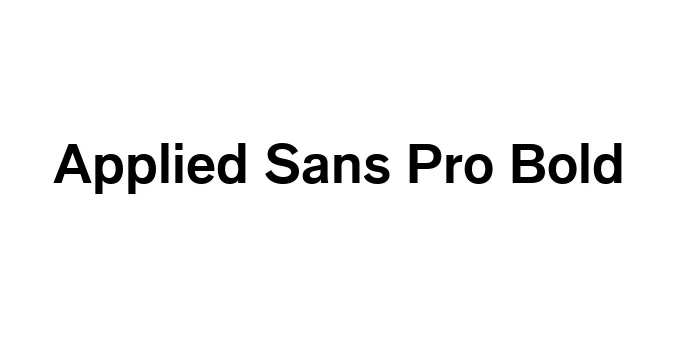
| Font Name | Applied Sans Pro |
| Style | Bold |
| Category | Sans Serif |
| Designer | Lucas de Groot |
| Copyright | Copyright © 2016 Monotype Imaging Inc. All rights reserved. |
| License | Free for Personal Use |
| Total Character | 425 |
| Recommended Line Height | 1.24 |
| Ascent | 977 |
| Descent | 259 |
| Units Per em | 1000 |
| Total Vertical Range | 1236 |
| Max Advance Width | 1164 |
| Max Advance Height | N/A |
| Underline Position | -100 |
| Similar Fonts | Helvetica, Futura, Gotham, Arial |
Applied Sans Pro Bold Font Details : Font Free Download
Applied Sans Pro Bold is a contemporary sans-serif typeface designed by the renowned Lucas de Groot. Characterized by its geometric foundation and subtle humanist touches, this font was crafted to provide exceptional legibility in both print and digital environments. Its robust weight and clean lines make it a versatile choice for modern branding projects that require a sense of authority and clarity.
Originally developed to bridge the gap between traditional grotesques and modern geometric styles, the Applied Sans family offers a wide range of weights. The Bold variant specifically excels in high-impact scenarios such as headlines, signage, and user interface elements. Over the years, it has become a staple for designers looking for a typeface that balances technical precision with a friendly, approachable aesthetic.
Applied Sans Pro Bold Best Uses
Perfect for bold headlines and subheadings in magazines and journals.
Highly readable for UI elements, navigation menus, and digital displays.
Ideal for creating strong and memorable corporate logos and visual identities.
Excellent for environmental graphics and wayfinding due to its high visibility.
Applied Sans Pro Bold Glyphs

Download Font
Package Size: 353.3 KB
Available Formats: .TTF