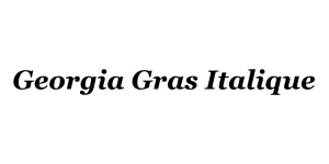
Georgia Gras Italique
SerifDesigned by Matthew Carter
Designed by Robin Nicholas and Patricia Saunders
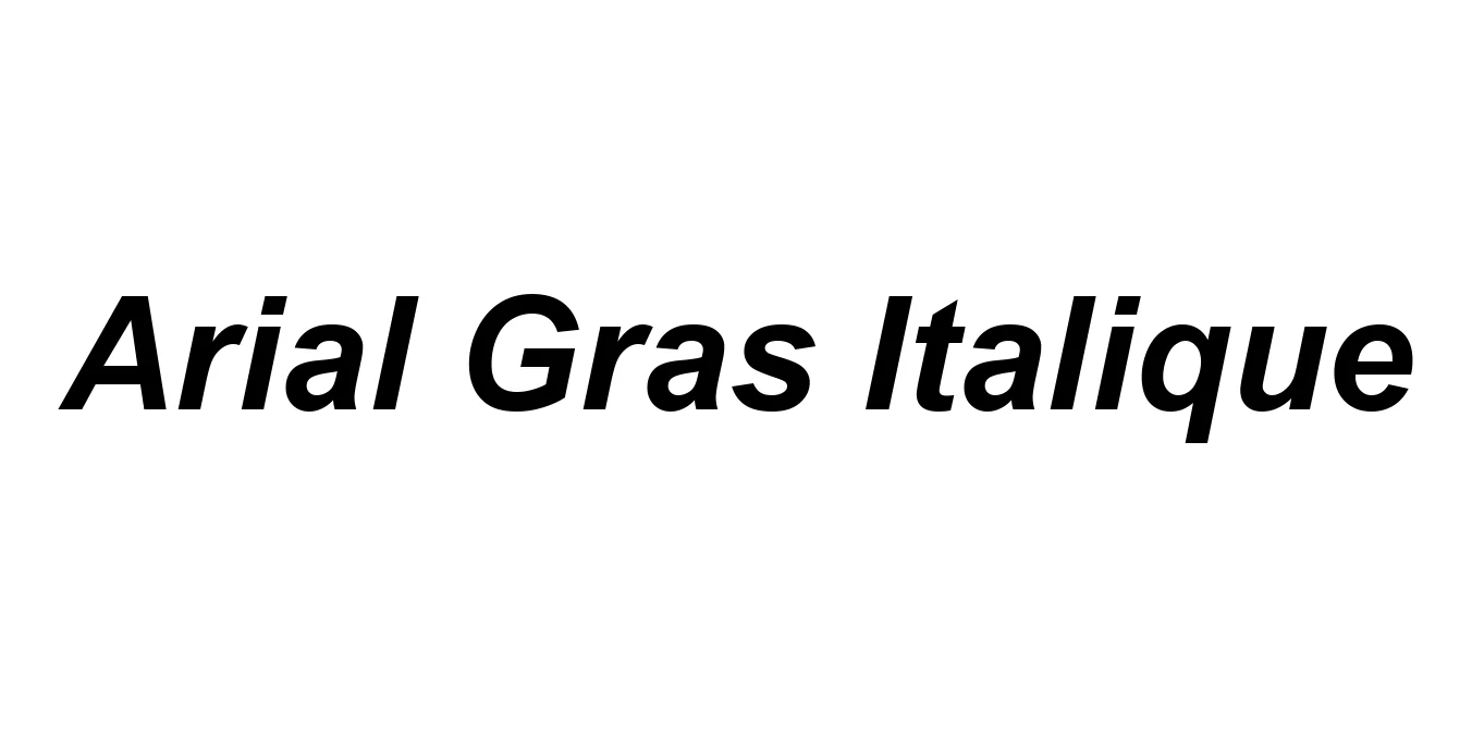
| Font Name | Arial |
| Style | Gras Italique |
| Category | Neo-Grotesque Sans Serif |
| Designer | Robin Nicholas and Patricia Saunders |
| Copyright | © 2017 The Monotype Corporation. All Rights Reserved. Hebrew OpenType Layout logic copyright © 2003 & 2007, Ralph Hancock & John Hudson. This layout logic for Biblical Hebrew is open source software under the MIT License; see embedded license description for details. |
| License | Free for Personal Use / Commercial License Required |
| Total Character | 2667 |
| Recommended Line Height | 1.12 |
| Ascent | 1854 |
| Descent | 434 |
| Units Per em | 2048 |
| Total Vertical Range | 2288 |
| Max Advance Width | 2730 |
| Max Advance Height | N/A |
| Underline Position | -217 |
| Similar Fonts | Helvetica Bold Italic, Arimo Bold Italic, Liberation Sans Bold Italic, Nimbus Sans L Bold Italic |
Arial Gras Italique, known internationally as Arial Bold Italic, was developed in 1982 by Monotype's design team to serve as a metrically compatible alternative to Helvetica for IBM's high-resolution laser printers. This specific variant was engineered to provide a weightier, more dynamic emphasis within the Arial family while maintaining the same character widths as its competitors, ensuring seamless layout transitions across different platforms. Despite its reputation as a functional substitute, its design roots are more closely linked to the 19th-century Monotype Grotesque series, which lends the typeface a slightly more humanist and rounded character than the rigid, modernist geometry of its contemporaries.
Technical analysis of the letterforms reveals a generous x-height that significantly enhances legibility in dense compositions. The 'Gras' (Bold) weight provides a substantial visual punch without sacrificing the integrity of the counters, while the 'Italique' slant is expertly balanced to suggest motion and urgency. Unlike its rivals, Arial's terminals are cut at angles rather than horizontally, which facilitates a more open aperture. This design choice, combined with the softened curves on the 'a' and 'R', allows for superior air flow between characters, making it an exceptionally reliable choice for both high-resolution print and low-resolution screen rendering where clarity is paramount.
Ideal for emphasizing specific warnings or terminology within dense manuals.
Effective for pull-quotes and subheaders that require a sense of urgency.
Excellent for status updates and bold UI elements that need to stand out across various devices.

Package Size: 704.2 KB
Available Formats: .TTF
Designed by Matthew Carter
Designed by Robin Nicholas and Patricia Saunders