Alumni Sans Thin Regular
Sans SerifDesigned by Robert Leuschke

Designed by Eric Gill
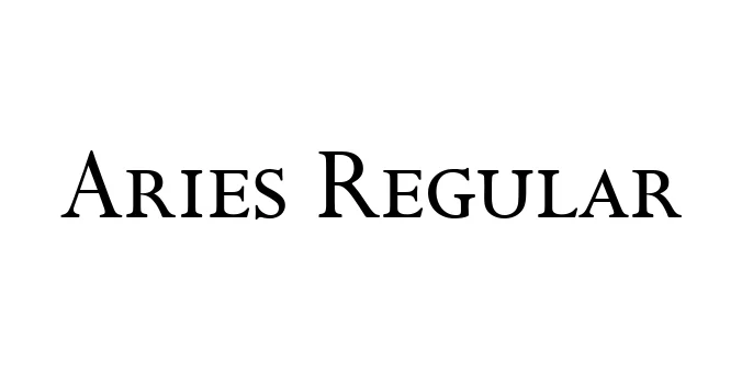
| Font Name | Aries |
| Style | Regular |
| Category | Serif |
| Designer | Eric Gill |
| Copyright | \251 Copyright by Panache Typography, 1995 |
| License | Free for Personal Use |
| Total Character | 221 |
| Recommended Line Height | 1.2 |
| Ascent | 911 |
| Descent | 293 |
| Units Per em | 1000 |
| Total Vertical Range | 1204 |
| Max Advance Width | 1126 |
| Max Advance Height | N/A |
| Underline Position | -75 |
| Similar Fonts | Perpetua, Joanna, Felicity |
Aries Regular is a distinctive serif typeface designed by the renowned artist and typographer Eric Gill in 1932. Originally commissioned for the Aries Press, the font reflects Gill's signature blend of classical proportions and modernist sensibilities. It features a unique set of letterforms that balance elegance with a sturdy, readable structure, making it a standout example of early 20th-century British typography.
The design of Aries is characterized by its sharp serifs and high-contrast strokes, which lend it a formal yet artistic quality. While it shares some DNA with Gill's more famous works like Perpetua, Aries offers a more specialized aesthetic that excels in literary settings and high-end editorial design. Its historical significance and timeless appeal continue to make it a favored choice for designers seeking a touch of sophisticated craftsmanship.
Perfect for high-end magazine layouts and literary journals.
Ideal for body text in books that require a classic, sophisticated feel.
Works well for luxury brands and artisan identity systems.
Its sharp serifs make it an excellent choice for elegant display headers.

Designed by Robert Leuschke
Designed by Robert Leuschke

Designed by Robert Leuschke

Designed by Robert Leuschke