Athens
Designed by Susan Kare (Original Bitmap) / Various Digital Interpretations
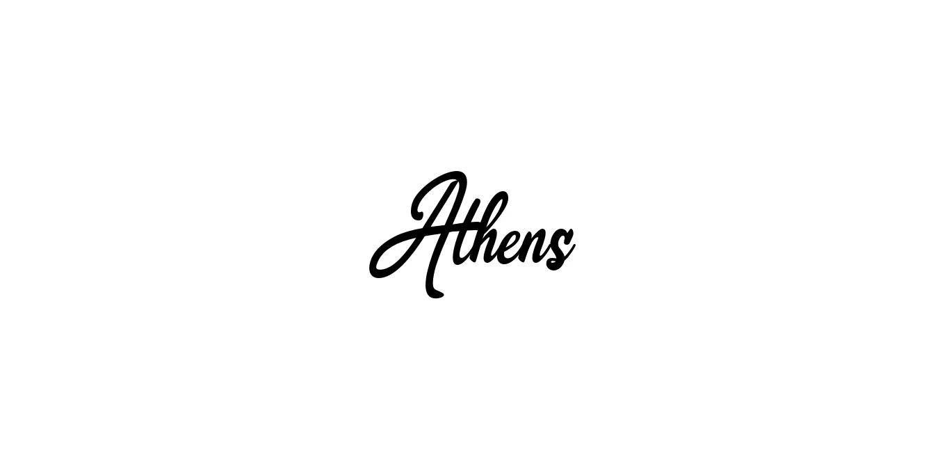
| Font Name | Athens |
| Style | DEMO |
| Category | Slab Serif |
| Designer | Susan Kare (Original Bitmap) / Various Digital Interpretations |
| Copyright | Copyright (c) 2021, ikiiko |
| License | Free for Personal Use |
| Total Character | 95 |
| Recommended Line Height | 1.22 |
| Ascent | 863 |
| Descent | 355 |
| Units Per em | 1000 |
| Total Vertical Range | 1218 |
| Max Advance Width | 787 |
| Max Advance Height | N/A |
| Underline Position | -75 |
| Similar Fonts | Clarendon, Courier, Roboto Slab, Memphis |
Athens Font Details : Font Free Download
Athens is a distinguished typeface with deep roots in the evolution of digital typography, originally conceived by Susan Kare for the Apple Macintosh in 1984. As part of the iconic series of fonts named after world cities, Athens was designed to provide a sophisticated, slab-serif alternative to the more utilitarian system fonts of the era. Over the decades, it has transitioned from its 72-dpi bitmap origins into various modernized vector formats, maintaining its legacy as a typeface that bridges the gap between early computing history and contemporary graphic design.
Technical analysis of Athens reveals a robust geometric structure characterized by high-contrast slab serifs and a substantial visual weight. The x-height is remarkably tall, which enhances legibility in display settings and ensures that the counters remain open and clear. The letterforms exhibit a rigid, almost architectural quality, with flat terminals and heavy horizontal stresses that create a sense of stability and authority. This structural integrity makes Athens particularly effective for headlines, where its unique blend of 19th-century Egyptian style and digital precision can be fully appreciated.
Athens Best Uses
Ideal for creating a strong, established identity in logos and corporate headers.
Perfect for magazine headlines and pull quotes that require a sense of authority.
Excellent for hero sections and navigation menus where legibility is key.
Athens Glyphs
