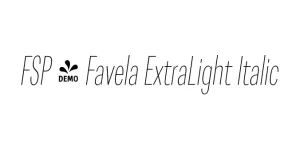
FSP - Favela ExtraLight Italic
Geometric Sans SerifDesigned by Mateusz Machalski
Designed by Adrian Frutiger
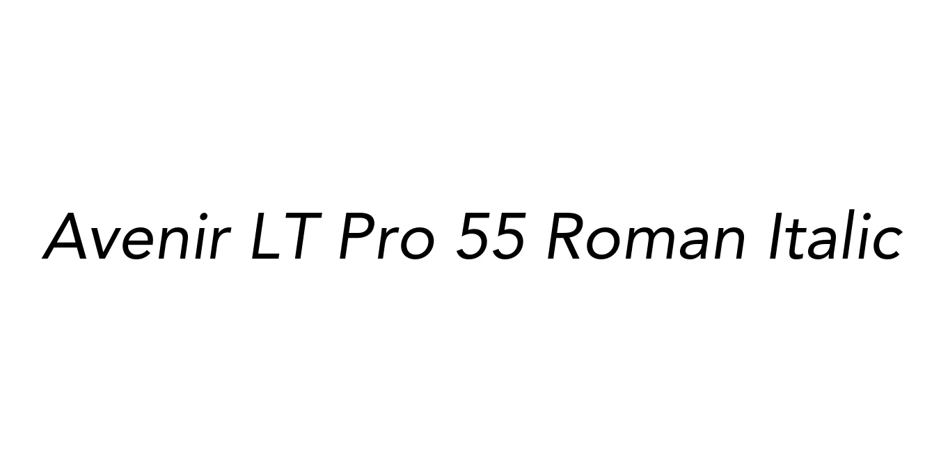
| Font Name | Avenir LT Pro 55 Roman |
| Style | Italic |
| Category | Geometric Sans-Serif |
| Designer | Adrian Frutiger |
| Copyright | Part of the digitally encoded machine readable outline data for producing the Typefaces provided is copyrighted © 2007 Linotype GmbH, www.linotype.com. All rights reserved. This software is the property of Linotype GmbH, and may not be reproduced, used, displayed, modified, disclosed or transferred without the express written approval of Linotype GmbH. The digitally encoded machine readable software for producing the Typefaces licensed to you is copyrighted (c) 1989, 1995 Adobe Systems. All Rights Reserved. This software is the property of Adobe Systems Incorporated and its licensors, and may not be reproduced, used, displayed, modified, disclosed or transferred without the express written approval of Adobe. Avenir is a trademark of Linotype GmbH and may be registered in certain jurisdictions. This typeface is original artwork of Adrian Frutiger. The design may be protected in certain jurisdictions. |
| License | Commercial License Required |
| Total Character | 386 |
| Recommended Line Height | 1.18 |
| Ascent | 928 |
| Descent | 250 |
| Units Per em | 1000 |
| Total Vertical Range | 1178 |
| Max Advance Width | 1018 |
| Max Advance Height | N/A |
| Underline Position | -75 |
| Similar Fonts | Futura, Gotham, Montserrat, Nunito Sans, Proxima Nova |
Avenir LT Pro 55 Roman Italic is a masterwork of geometric sans-serif design, originally conceived by the legendary typographer Adrian Frutiger in 1988. The name 'Avenir' is the French word for 'future,' reflecting Frutiger’s desire to create a typeface that would provide a more humanistic and organic alternative to rigid geometric fonts like Futura. This specific italic variant maintains the clean, circular proportions of the Roman weight while adding a subtle slant that enhances the rhythm and flow of the text.
The 55 Roman Italic is celebrated for its exceptional legibility and optical balance. By incorporating vertical strokes that are slightly thicker than the horizontal ones and using open counters, Frutiger ensured that the font remains clear even at smaller sizes. This has made Avenir a premier choice for global brands, editorial design, and high-end user interfaces, bridging the gap between cold geometry and warm, approachable typography.
Perfect for creating a clean, professional, and forward-thinking brand image.
Sophisticated enough for body copy in magazines and high-end publications.
Highly legible on screens for both menus and descriptive text.
Its clear proportions make it ideal for signage and architectural environments.

Package Size: 43.6 KB
Available Formats: .OTF
Designed by Mateusz Machalski
Designed by Mateusz Machalski
Designed by Frederic W. Goudy
Designed by Paul Renner (Original), FontSite Inc.