ITC Franklin Gothic Std Book Regular
Sans SerifDesigned by Victor Caruso (ITC version), Morris Fuller Benton (Original)

Designed by Adrian Frutiger
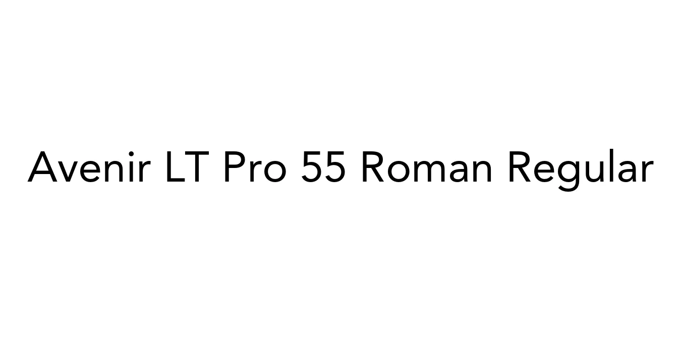
| Font Name | Avenir LT Pro 55 Roman |
| Style | Regular |
| Category | Geometric Sans-Serif |
| Designer | Adrian Frutiger |
| Copyright | Part of the digitally encoded machine readable outline data for producing the Typefaces provided is copyrighted © 2007 Linotype GmbH, www.linotype.com. All rights reserved. This software is the property of Linotype GmbH, and may not be reproduced, used, displayed, modified, disclosed or transferred without the express written approval of Linotype GmbH. The digitally encoded machine readable software for producing the Typefaces licensed to you is copyrighted (c) 1989, 1995 Adobe Systems. All Rights Reserved. This software is the property of Adobe Systems Incorporated and its licensors, and may not be reproduced, used, displayed, modified, disclosed or transferred without the express written approval of Adobe. Avenir is a trademark of Linotype GmbH and may be registered in certain jurisdictions. This typeface is original artwork of Adrian Frutiger. The design may be protected in certain jurisdictions. |
| License | Personal Use Only / Commercial License Required |
| Total Character | 386 |
| Recommended Line Height | 1.18 |
| Ascent | 928 |
| Descent | 250 |
| Units Per em | 1000 |
| Total Vertical Range | 1178 |
| Max Advance Width | 1018 |
| Max Advance Height | N/A |
| Underline Position | -75 |
| Similar Fonts | Futura, Montserrat, Nunito, Gotham, Proxima Nova |
Avenir LT Pro 55 Roman was designed by the legendary Adrian Frutiger in 1988. The name 'Avenir' is the French word for 'future,' signaling Frutiger's intent to create a typeface that would rival the popularity of classics like Futura while offering a more humanistic and organic approach. Unlike strictly geometric sans-serifs, Avenir features subtle variations in stroke weight and optical corrections that enhance its legibility and warmth, making it one of the most versatile fonts in the modern era.
The 55 Roman weight serves as the backbone of the entire family, providing a perfectly balanced weight that is neither too thin nor too heavy. Since its release, it has been widely adopted by major corporations and design firms globally for its timeless and clean aesthetic. It bridges the gap between the rigid geometry of the early 20th century and the high-readability requirements of 21st-century digital interfaces, ensuring its place as a staple in professional typography.
Perfect for logos and consistent brand messaging across various platforms.
Highly legible for buttons, menus, and dashboard elements in apps.
Works beautifully for body text in high-end magazines and digital publications.
Delivers a clean, professional look for headlines and promotional banners.

Package Size: 43.0 KB
Available Formats: .OTF
Designed by Victor Caruso (ITC version), Morris Fuller Benton (Original)
Designed by Rod McDonald
Designed by Jean-Baptiste Morizot

Designed by Jason Mark Jones