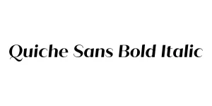
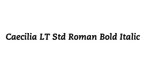
Caecilia LT Std Roman Bold Italic
Slab SerifDesigned by Peter Matthias Noordzij
Designed by Adrian Frutiger
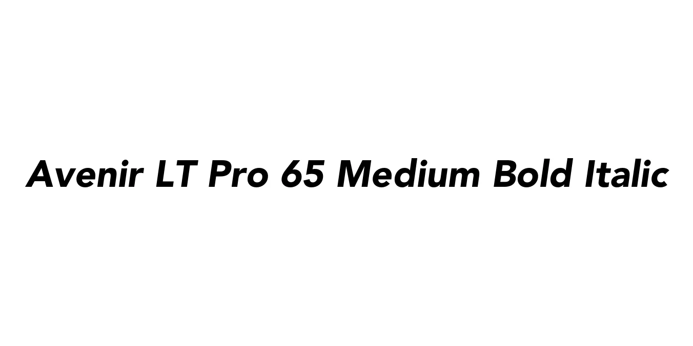
| Font Name | Avenir LT Pro 65 Medium |
| Style | Bold Italic |
| Category | Geometric Sans-Serif |
| Designer | Adrian Frutiger |
| Copyright | Part of the digitally encoded machine readable outline data for producing the Typefaces provided is copyrighted © 2007 Linotype GmbH, www.linotype.com. All rights reserved. This software is the property of Linotype GmbH, and may not be reproduced, used, displayed, modified, disclosed or transferred without the express written approval of Linotype GmbH. The digitally encoded machine readable software for producing the Typefaces licensed to you is copyrighted (c) 1989, 1995 Adobe Systems. All Rights Reserved. This software is the property of Adobe Systems Incorporated and its licensors, and may not be reproduced, used, displayed, modified, disclosed or transferred without the express written approval of Adobe. Avenir is a trademark of Linotype GmbH and may be registered in certain jurisdictions. This typeface is original artwork of Adrian Frutiger. The design may be protected in certain jurisdictions. |
| License | Commercial License Required |
| Total Character | 386 |
| Recommended Line Height | 1.21 |
| Ascent | 920 |
| Descent | 288 |
| Units Per em | 1000 |
| Total Vertical Range | 1208 |
| Max Advance Width | 1167 |
| Max Advance Height | N/A |
| Underline Position | -75 |
| Similar Fonts | Futura, Montserrat, Proxima Nova, Nunito, Gotham |
Avenir LT Pro 65 Medium Bold Italic is a sophisticated geometric sans-serif typeface designed by the renowned Adrian Frutiger in 1988. The name 'Avenir' translates to 'future' in French, reflecting the font's intended role as a more humanistic and harmonious successor to earlier geometric designs like Futura and Erbar. By incorporating optical corrections and organic nuances, Frutiger created a typeface that feels both modern and timeless.
The 65 Medium Bold Italic variant provides a powerful yet graceful emphasis within the Avenir hierarchy. It combines the structural integrity of geometric shapes with a slanted profile that adds a sense of motion and urgency. This font is celebrated for its incredible legibility across various sizes, making it a staple for designers who require a professional look that remains approachable and clean in both digital and print mediums.
Perfect for creating a trustworthy and modern brand image.
Great for highlighting key information or subheadings in print media.
Highly readable for digital interfaces and emphasized call-to-action buttons.
Effective for bold, dynamic headlines that require a sophisticated touch.

Package Size: 44.8 KB
Available Formats: .OTF
Designed by Peter Matthias Noordzij
Designed by TypeType Team
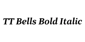
Designed by Ivan Gladkikh, Marina Khodak, and the TypeType Team
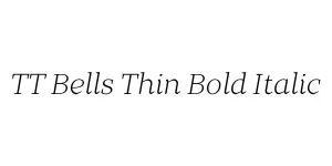
Designed by Adam Ladd