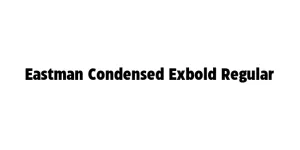
Hollow Space Regular
Display / Sci-FiDesigned by Youssef Habchi
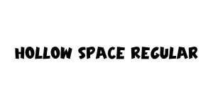
Designed by Adrian Frutiger
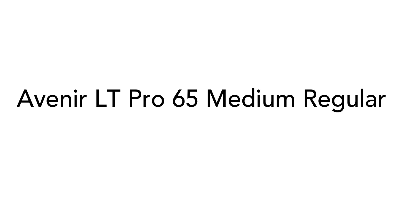
| Font Name | Avenir LT Pro 65 Medium |
| Style | Regular |
| Category | Geometric Sans-Serif |
| Designer | Adrian Frutiger |
| Copyright | Part of the digitally encoded machine readable outline data for producing the Typefaces provided is copyrighted © 2007 Linotype GmbH, www.linotype.com. All rights reserved. This software is the property of Linotype GmbH, and may not be reproduced, used, displayed, modified, disclosed or transferred without the express written approval of Linotype GmbH. The digitally encoded machine readable software for producing the Typefaces licensed to you is copyrighted (c) 1989, 1995 Adobe Systems. All Rights Reserved. This software is the property of Adobe Systems Incorporated and its licensors, and may not be reproduced, used, displayed, modified, disclosed or transferred without the express written approval of Adobe. Avenir is a trademark of Linotype GmbH and may be registered in certain jurisdictions. This typeface is original artwork of Adrian Frutiger. The design may be protected in certain jurisdictions. |
| License | Commercial License Required |
| Total Character | 386 |
| Recommended Line Height | 1.21 |
| Ascent | 924 |
| Descent | 282 |
| Units Per em | 1000 |
| Total Vertical Range | 1206 |
| Max Advance Width | 1056 |
| Max Advance Height | N/A |
| Underline Position | -75 |
| Similar Fonts | Futura, Gotham, Montserrat, Nunito, Helvetica Neue |
Avenir LT Pro 65 Medium is a cornerstone of the Avenir family, designed by the legendary typographer Adrian Frutiger and released by Linotype in 1988. The name 'Avenir' is the French word for 'future,' signaling Frutiger's intent to create a typeface that would serve as a more humanistic and organic alternative to the rigid geometric sans-serifs of the early 20th century, such as Futura. By incorporating subtle weight variations and optical corrections, Frutiger achieved a balance that feels both modern and exceptionally approachable.
The 65 Medium weight is specifically engineered for high legibility across a variety of mediums. As part of the Avenir LT Pro series, it includes an expanded character set and refined spacing that makes it a favorite for professional designers worldwide. Its timeless aesthetic has led it to be adopted by major corporations and government entities for branding, signage, and digital interfaces, proving its versatility and enduring appeal in the global design landscape.
Ideal for professional logos and cohesive corporate identity systems.
Perfect for headlines and body text in premium magazines and annual reports.
Highly readable on digital screens for user interfaces and navigation menus.
Clear, distinguishable characters make it excellent for wayfinding and environmental graphics.

Package Size: 43.8 KB
Available Formats: .OTF
Designed by Youssef Habchi
Designed by Francesco Canovaro, Cosimo Lorenzo Pancini, and Andrea Tartarelli
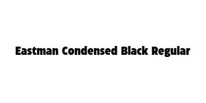
Designed by Francesco Canovaro and Andrea Tartarelli
Designed by Francesco Canovaro, Andrea Tartarelli, and Cosimo Lorenzo Pancini