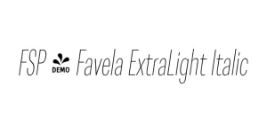
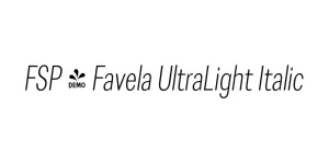
FSP - Favela ExtraLight Italic
Geometric Sans SerifDesigned by Mateusz Machalski
Designed by Adrian Frutiger and Akira Kobayashi
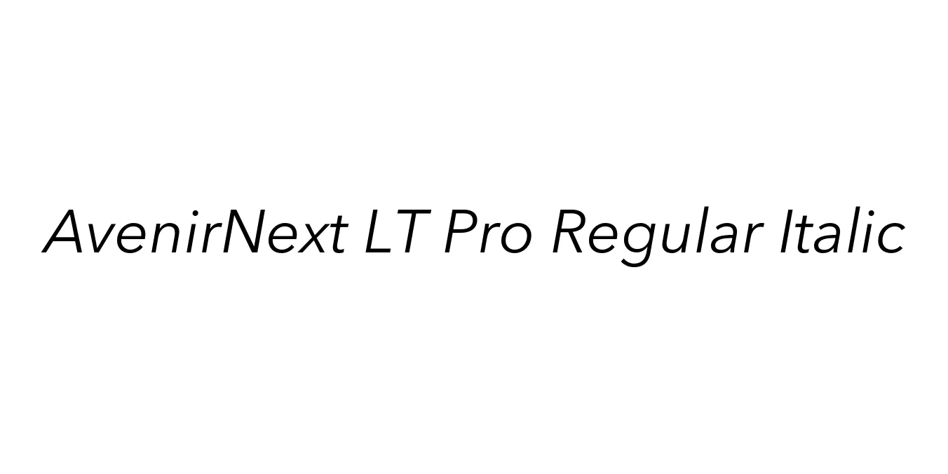
| Font Name | AvenirNext LT Pro Regular |
| Style | Italic |
| Category | Geometric Sans Serif |
| Designer | Adrian Frutiger and Akira Kobayashi |
| Copyright | Copyright (c) 2004 Linotype Library GmbH, www.linotype.com. All rights reserved. This software may not be reproduced, used, displayed, modified, disclosed or transferred without the express written approval of Linotype Library GmbH. Avenir is a trademark of Heidelberger Druckmaschinen AG, exclusively licensed through Linotype Library GmbH, and may be registered in certain jurisdictions. This typeface is original artwork of Adrian Frutiger and Akira Kobayashi. The design may be protected in certain jurisdictions. |
| License | Commercial License Required |
| Total Character | 372 |
| Recommended Line Height | 1.19 |
| Ascent | 946 |
| Descent | 244 |
| Units Per em | 1000 |
| Total Vertical Range | 1190 |
| Max Advance Width | 1000 |
| Max Advance Height | N/A |
| Underline Position | -75 |
| Similar Fonts | Futura, ITC Avant Garde Gothic, Proxima Nova, Gotham |
AvenirNext LT Pro Regular Italic is a sophisticated evolution of the original Avenir typeface, which was first designed by the legendary Adrian Frutiger in 1988. Realizing the need for a more comprehensive font family suited for the digital age, Frutiger collaborated with Akira Kobayashi to rework and expand the typeface into Avenir Next. This updated version offers improved technical precision and a wider range of weights, ensuring it remains one of the most versatile geometric sans-serifs available today.
The Regular Italic variant provides a graceful, slanted aesthetic that maintains the font's signature geometric harmony. Unlike many italics that feel like a departure from their upright counterparts, AvenirNext LT Pro Regular Italic feels like a natural, fluid extension of the family. It is widely praised by designers for its humanist warmth mixed with mathematical cleanliness, making it a favorite for high-end corporate identities, complex editorial layouts, and minimalist user interfaces.
Perfect for creating a clean and authoritative corporate visual identity.
Highly legible for navigation, buttons, and sub-headers in digital interfaces.
Excellent for pull quotes and sidebars in magazine and book layouts.
Conveys a sense of modern luxury and clarity in promotional materials.

Package Size: 58.0 KB
Available Formats: .OTF
Designed by Mateusz Machalski
Designed by Mateusz Machalski
Designed by Mateusz Machalski
Designed by Paulo Goode