Bauer Regular
Designed by Heinrich Jost
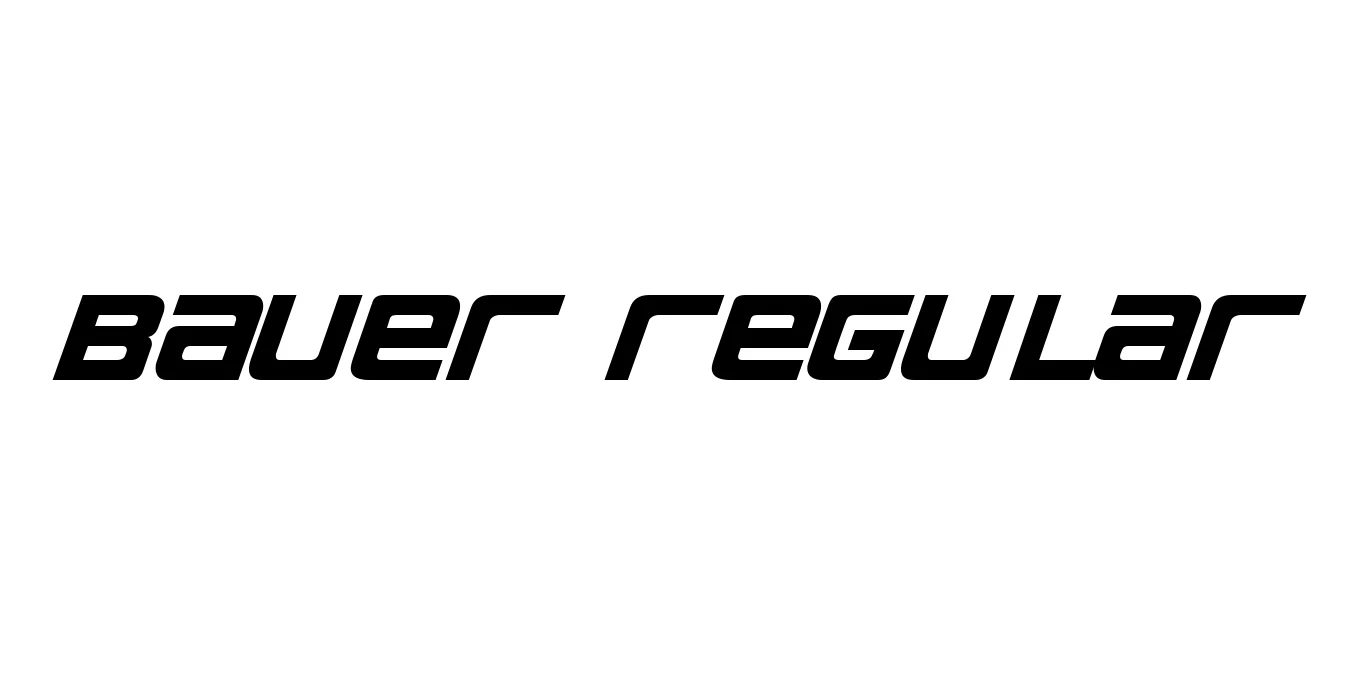
| Font Name | Bauer |
| Style | Regular |
| Category | Serif / Didone |
| Designer | Heinrich Jost |
| Copyright | Samuel Park 2000 - www.peppesbodega.nu/type |
| License | Free for Personal Use |
| Total Character | 163 |
| Recommended Line Height | 1.23 |
| Ascent | 1016 |
| Descent | 218 |
| Units Per em | 1000 |
| Total Vertical Range | 1234 |
| Max Advance Width | 1576 |
| Max Advance Height | N/A |
| Underline Position | -133 |
| Similar Fonts | Bodoni MT, Didot, LTC Bodoni, Poster Bodoni, Gianotten |
Bauer Regular Font Details : Font Free Download
The Bauer Regular font, often associated with the Bauer Bodoni family, was designed in 1926 by Heinrich Jost for the Bauer Type Foundry. This typeface is widely recognized as one of the most faithful and elegant interpretations of Giambattista Bodoni's original 18th-century designs, defined by its extreme contrast between thick and thin strokes and razor-sharp hairline serifs.
Because of its sophisticated and high-end aesthetic, Bauer Regular is a staple in the world of fashion, high-end editorial design, and luxury branding. Its vertical axis and clean, geometric construction provide a sense of timeless authority and refined craftsmanship that continues to dominate modern premium typography.
Bauer Regular Best Uses
Perfect for high-end magazine headlines and fashion editorial spreads.
Ideal for logos and packaging for premium brands and jewelry.
Excellent for wedding invitations and formal event menus that require a touch of class.
Great for large-scale advertisements where sharp detail and elegance are needed.
Bauer Regular Glyphs
