Perfume Sans 3 Bold
Sans SerifDesigned by Invasi Studio

Designed by Maniackers Design
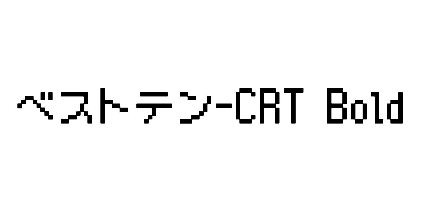
| Font Name | ベストテン-CRT |
| Style | Bold |
| Category | Pixel / Bitmap |
| Designer | Maniackers Design |
| Copyright | Copyright (C) 2013 M+ Font Project. FLOP DESIGN |
| License | Free for Personal and Commercial Use |
| Total Character | 10003 |
| Recommended Line Height | 1.2 |
| Ascent | 1080 |
| Descent | 120 |
| Units Per em | 1000 |
| Total Vertical Range | 1200 |
| Max Advance Width | 1000 |
| Max Advance Height | N/A |
| Underline Position | -75 |
| Similar Fonts | Misaki Font, PixelMplus10, DotGothic16, LittleLimit |
ベストテン-CRT Bold (Best Ten CRT Bold) is a specialized Japanese pixel font designed to replicate the nostalgic visual aesthetic of 1980s cathode-ray tube monitors. Created by Maniackers Design, this font is based on a 10x10 dot matrix grid, ensuring a perfect balance between retro charm and readability. The 'CRT' variant specifically incorporates horizontal scan-line effects and a slight distortion that mimics the phosphor glow and scanning electron beams characteristic of vintage arcade machines and television sets.
This bold iteration is particularly effective for high-impact visual communication that requires a technological, retro-gaming, or cybernetic atmosphere. It includes a comprehensive set of characters encompassing Hiragana, Katakana, and a substantial library of Kanji, making it a robust choice for developers and designers working on localized Japanese content. Whether used for digital interfaces or printed media, it provides an authentic low-fidelity look that transports viewers back to the early digital age.
Perfect for UI elements, dialogue boxes, and title screens in 8-bit or 16-bit style video games.
Ideal for creating nostalgic posters, apparel, and flyers with a 1980s computer or arcade theme.
Excellent for subtitles or title sequences intended to simulate old TV broadcasts or VHS aesthetic.

Designed by Invasi Studio
Designed by Fontna