Vanrott Regular
SerifDesigned by Craft Supply Co.

Designed by Francesco Canovaro
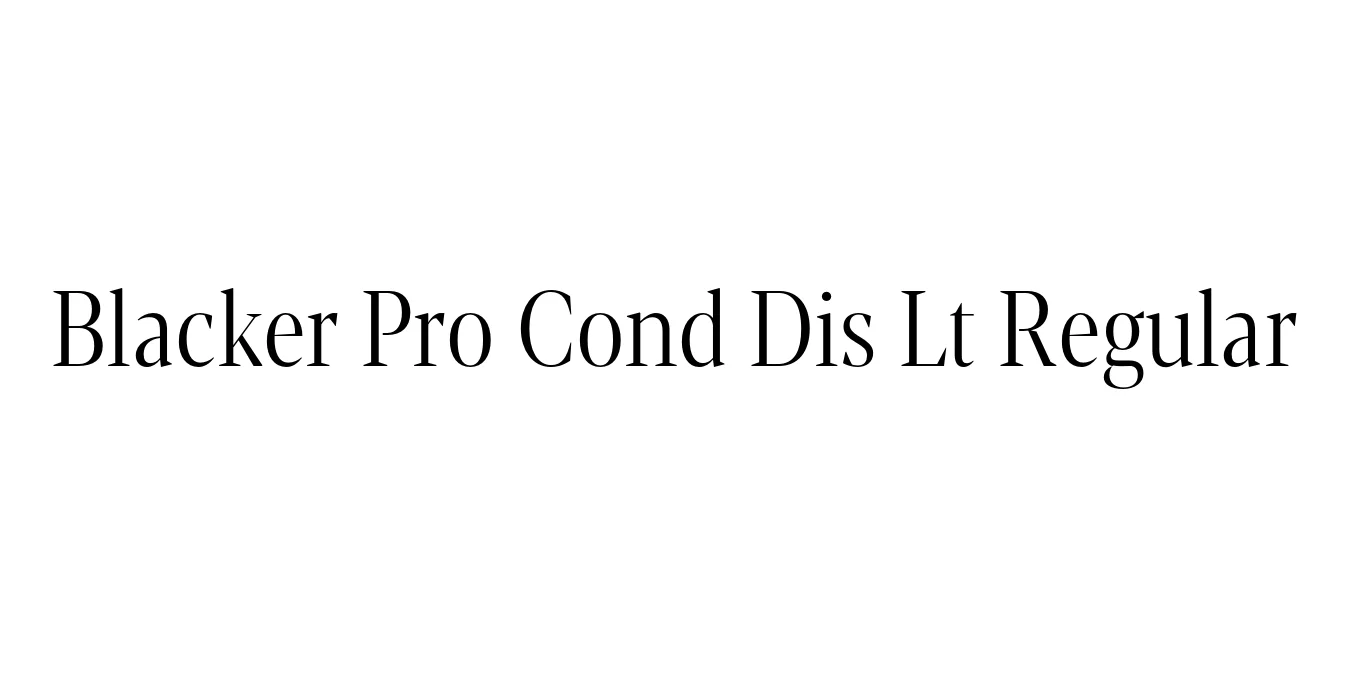
| Font Name | Blacker Pro Cond Dis Lt |
| Style | Regular |
| Category | Serif / Display |
| Designer | Francesco Canovaro |
| Copyright | Copyright © 2018 by Cosimo Lorenzo Pancini & Francesco Canovaro. All rights reserved. |
| License | Free for Personal Use |
| Total Character | 989 |
| Recommended Line Height | 1.44 |
| Ascent | 2350 |
| Descent | 600 |
| Units Per em | 2048 |
| Total Vertical Range | 2950 |
| Max Advance Width | 2401 |
| Max Advance Height | N/A |
| Underline Position | -150 |
| Similar Fonts | Ogg, Noe Display, ITC Clearface, Playfair Display |
Blacker Pro Cond Dis Lt Regular is a sophisticated condensed display weight within the acclaimed Blacker typeface family, designed by Francesco Canovaro for Zetafonts. The typeface is a contemporary reimagining of the high-contrast 'wicked' wedge serifs that defined the editorial aesthetics of the 1970s. This specific light condensed variant focuses on elegance and verticality, offering sharp, aggressive terminals balanced by a refined, slender structure.
The Pro version represents a massive expansion of the original design, featuring an extended character set and refined OpenType features for professional typesetting. Designed specifically for display use, the Condensed Display Light style excels in high-end publishing and luxury branding where space management is critical but visual impact remains the priority. It bridges the gap between vintage glamour and modern digital precision.
Perfect for high-impact headlines and sophisticated magazine layouts.
Ideal for luxury fashion brands and upscale visual identities.
Excellent for elegant posters and premium promotional campaigns.
Great for striking hero sections and large-scale typography.

Package Size: 174.3 KB
Available Formats: .OTF
Designed by Craft Supply Co.
Designed by Rafał Buchner

Designed by Reddit Creative Team

Designed by Duarte Ferreira