Broadway Italic
Designed by Morris Fuller Benton
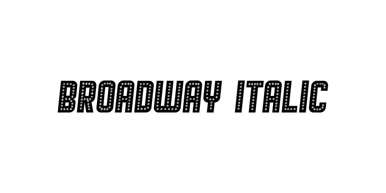
| Font Name | Broadway |
| Style | Italic |
| Category | Display |
| Designer | Morris Fuller Benton |
| Copyright | Copyright (c) 2018 by Vladimir Nikolic. All rights reserved. |
| License | Free for Personal Use |
| Total Character | 71 |
| Recommended Line Height | 0.77 |
| Ascent | 697 |
| Descent | 74 |
| Units Per em | 1000 |
| Total Vertical Range | 771 |
| Max Advance Width | 645 |
| Max Advance Height | N/A |
| Underline Position | -75 |
| Similar Fonts | Ritz, Peignot, Metropolis, Plaza |
Broadway Italic Font Details : Font Free Download
Broadway is a quintessential Art Deco typeface. Originally designed by Morris Fuller Benton in 1927 for the American Type Founders (ATF), it was initially intended as a display face for high-contrast advertising and high-end posters. Its bold, geometric forms and heavy thick-to-thin contrast perfectly capture the visual culture of the Jazz Age and the Roaring Twenties.
The Broadway Italic variant adds a dynamic, slanted perspective to the classic heavy design, maintaining its high-impact presence while offering a sense of motion and flair. It is globally recognized for its deep association with Old Hollywood, theater marquee signage, and 1930s-style sophistication, making it a staple for retro-themed graphics and decorative headings.
Broadway Italic Best Uses
Excellent for creating eye-catching headlines with a distinct 1920s or 1930s flair.
Ideal for brand identities that aim to convey luxury, historical elegance, or cabaret aesthetics.
The classic choice for Broadway-themed events, movie titles, and theatrical invitations.
Broadway Italic Glyphs
