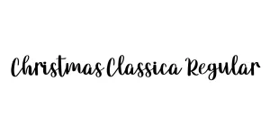
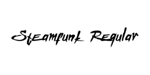
Steamfunk Regular
Display / DecorativeDesigned by Gluk
Designed by Nick Curtis
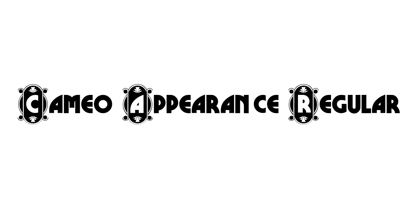
| Font Name | CameoAppearance |
| Style | Regular |
| Category | Display / Art Deco |
| Designer | Nick Curtis |
| Copyright | (c) 2000 Nick Curtis. All Rights Reserved. Generated by Fontographer 3.52 |
| License | Free for Personal Use |
| Total Character | 394 |
| Recommended Line Height | 1.1 |
| Ascent | 751 |
| Descent | 348 |
| Units Per em | 1000 |
| Total Vertical Range | 1099 |
| Max Advance Width | 775 |
| Max Advance Height | N/A |
| Underline Position | -80 |
| Similar Fonts | Broadway, Peignot, Parisian, Metropolis |
Cameo Appearance Regular is a sophisticated and nostalgic display typeface designed by Nick Curtis. It is meticulously based on the hand-lettered titles of a 1931 film poster, capturing the quintessential elegance of the early Art Deco period. The font features striking high-contrast strokes and elongated vertical forms that immediately evoke the golden age of Hollywood and high-society glamour.
This typeface is particularly effective for designers looking to recreate a vintage aesthetic with a modern, clean execution. Its distinct letterforms and geometric balance make it a standout choice for high-end editorial work, period-piece branding, and decorative headlines. Cameo Appearance remains a popular staple for those wanting to add a touch of historical class and luxury to their creative projects.
Ideal for luxury boutique branding and high-end visual identities.
Perfect for movie posters, jazz festivals, or theater promotions.
Adds a touch of 1930s sophistication to gala or wedding stationery.
Excellent for magazine mastheads and stylish decorative headers.

Designed by Gluk
Designed by Modular InfoTech Pvt. Ltd.
Designed by Mans Greback
Designed by Mans Greback