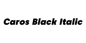
Caros Black Italic
Sans SerifDesigned by Creatype Studio
Designed by Jan-Christian Bruun
| Font Name | Caros |
| Style | Italic |
| Category | Geometric Sans Serif |
| Designer | Jan-Christian Bruun |
| Copyright | Copyright (c) 2017 by Lee, Hyun-Seung. All rights reserved. |
| License | Free for Personal Use |
| Total Character | 666 |
| Recommended Line Height | 1.21 |
| Ascent | 1920 |
| Descent | 492 |
| Units Per em | 2000 |
| Total Vertical Range | 2412 |
| Max Advance Width | 2576 |
| Max Advance Height | N/A |
| Underline Position | -390 |
| Similar Fonts | Gotham, Montserrat, Proxima Nova, Avenir |
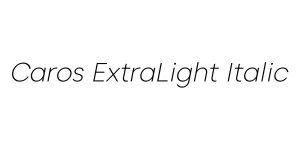
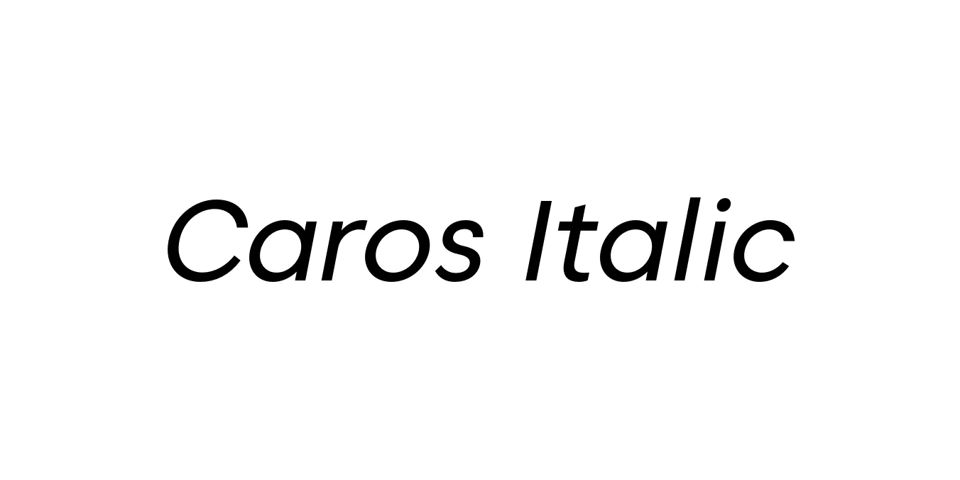
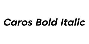
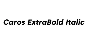
Caros Italic is a contemporary geometric sans-serif typeface designed by Jan-Christian Bruun. This font family was crafted with a focus on purity and geometric precision, making it an excellent choice for modern branding projects. The italic variant provides a subtle yet dynamic slant that maintains the legibility and clean lines of the original upright version, ensuring it remains versatile across various digital and print mediums.
The typeface is characterized by its open apertures and balanced proportions, which contribute to its neutral yet sophisticated aesthetic. Since its release, Caros has been favored by graphic designers for its ability to blend seamlessly into minimalist layouts while still offering enough character to stand out in headlines. Its professional appearance makes it a go-to option for corporate identities, editorial design, and high-end user interface projects.
Ideal for creating clean and modern corporate identities.
Works perfectly for stylish body text and emphasis in magazines.
Highly legible for user interfaces and mobile applications.
Effective for headlines that require a sophisticated and direct tone.

Package Size: 140.3 KB
Available Formats: .OTF
Designed by Creatype Studio
Designed by Creatype Studio
Designed by Creatype Studio
Designed by Creatype Studio