Alesand ExtBd Regular
Sans-SerifDesigned by Designova

Designed by Susan Kare
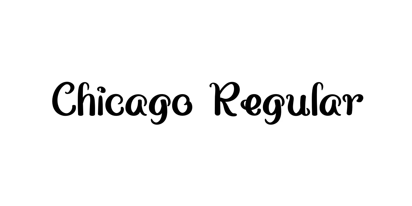
| Font Name | Chicago |
| Style | Regular |
| Category | Sans Serif / Bitmap |
| Designer | Susan Kare |
| Copyright | N/A |
| License | Free for Personal Use |
| Total Character | 178 |
| Recommended Line Height | 1.18 |
| Ascent | 873 |
| Descent | 308 |
| Units Per em | 1000 |
| Total Vertical Range | 1181 |
| Max Advance Width | 931 |
| Max Advance Height | N/A |
| Underline Position | 0 |
| Similar Fonts | Charcoal, Geneva, Silkscreen |
Chicago Regular was originally designed by Susan Kare for Apple Computer in 1984. It was the first font developed specifically for the Macintosh operating system, crafted to maintain high legibility on the low-resolution black-and-white screens of the era. As a bitmap font, its unique, chunky stroke style and distinct letterforms became the visual identity of Apple's early user interface.
While it began its life as a pixel-based screen font, it was later converted to a TrueType vector format to accommodate high-resolution printing. Beyond the Macintosh OS, Chicago gained massive cultural recognition as the primary interface typeface for the first four generations of the Apple iPod. Today, it remains a beloved icon of tech history, frequently used by designers to evoke a sense of 1980s and 1990s retro-digital nostalgia.
Ideal for creating retro-themed menus and system interfaces.
Perfect for 8-bit or 16-bit inspired video game typography.
Great for landing pages requiring a nostalgic computer aesthetic.
Excellent for bold, tech-focused posters and headlines.

Designed by Designova
Designed by Pradipta Creative

Designed by VP Creative Shop
Designed by Yai Salinas