Crane Normal
Designed by Luzi Gantenbein
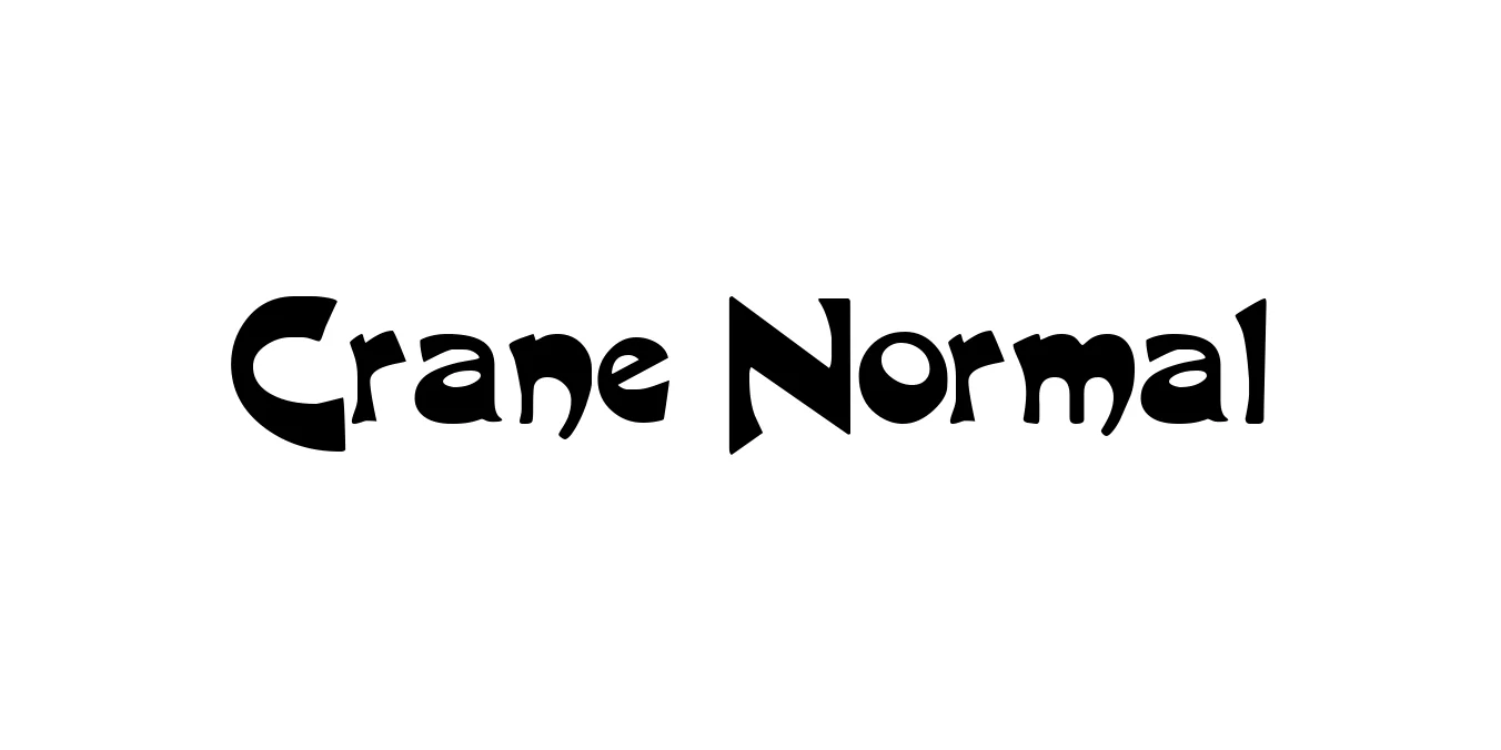
| Font Name | Crane |
| Style | Normal |
| Category | Serif |
| Designer | Luzi Gantenbein |
| Copyright | (c) 1996 Computer Support Corporation |
| License | Free for Personal Use |
| Total Character | 221 |
| Recommended Line Height | 1.21 |
| Ascent | 910 |
| Descent | 301 |
| Units Per em | 1000 |
| Total Vertical Range | 1211 |
| Max Advance Width | 1304 |
| Max Advance Height | N/A |
| Underline Position | -133 |
| Similar Fonts | Times New Roman, Adobe Caslon, Georgia, Minion Pro |
Crane Normal Font Details : Font Free Download
Crane Normal is a sophisticated serif typeface designed by Luzi Gantenbein, blending the timeless proportions of early 20th-century typography with a modern, clean aesthetic. The font is characterized by its balanced stroke weights, sharp serifs, and exceptional legibility, making it a staple for designers who require a typeface that performs equally well in print and digital environments.
Throughout its development, Crane Normal was meticulously crafted to excel in high-end editorial work and corporate branding projects. Its subtle contrast and rhythmic flow allow it to provide a comfortable reading experience in long-form body text, while its elegant structure remains impactful when utilized in headlines and title sequences.
Crane Normal Best Uses
Perfect for high-end magazines, newspapers, and book layouts.
Ideal for creating a sense of luxury and established authority in corporate identities.
Provides a clean and professional look for long-form articles and blog posts.
Excellent for invitations and business cards that require a touch of class.
Crane Normal Glyphs

Download Font
Package Size: 56.9 KB
Available Formats: .TTF