FSP - Favela ExtraLight Italic
Geometric Sans SerifDesigned by Mateusz Machalski

Designed by Gustav Schroeder
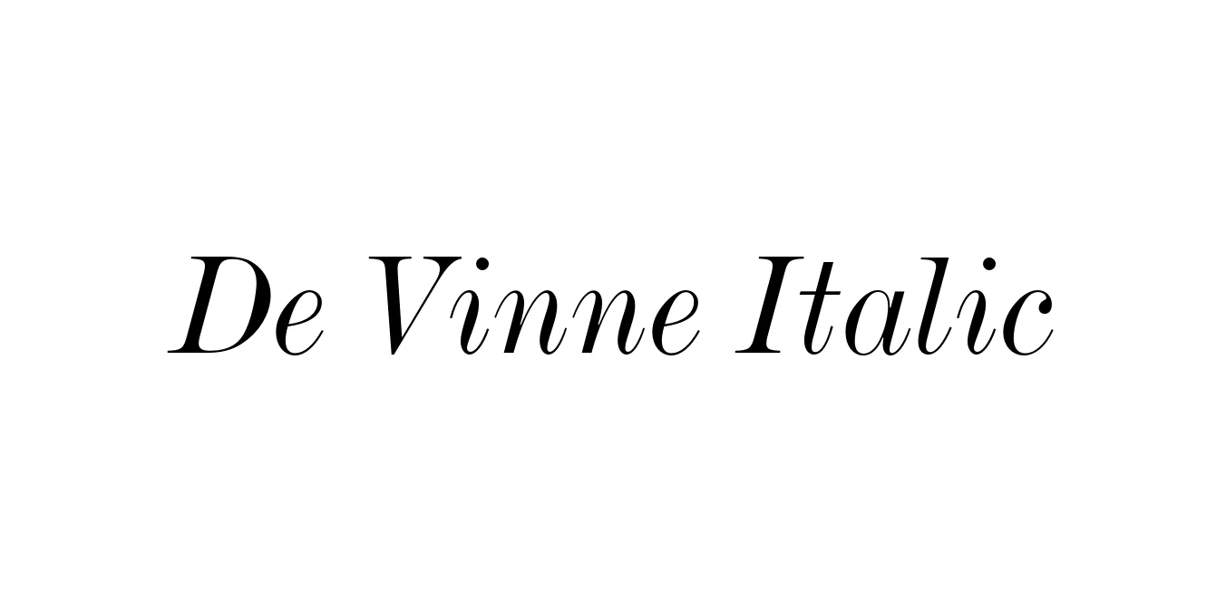
| Font Name | De Vinne |
| Style | Italic |
| Category | Serif |
| Designer | Gustav Schroeder |
| Copyright | Copyright 1990-1999 as an unpublished work by Bitstream Inc. All rights reserved. Confidential. |
| License | Free for Personal Use |
| Total Character | 229 |
| Recommended Line Height | 1.17 |
| Ascent | 936 |
| Descent | 236 |
| Units Per em | 1000 |
| Total Vertical Range | 1172 |
| Max Advance Width | 1216 |
| Max Advance Height | N/A |
| Underline Position | -99 |
| Similar Fonts | Bodoni, Century Schoolbook, Scotch Roman, Clarendon |
The De Vinne Italic typeface holds a significant place in typographic history, named in honor of the renowned American printer Theodore Low De Vinne. Despite the name, the design was actually executed by Gustav Schroeder for the Central Type Foundry in 1890. It was created to fill the need for a versatile, high-contrast serif that could bridge the gap between traditional old-style faces and the more modern, geometric designs emerging at the turn of the century.
The italic version is characterized by its elegant, rhythmic slant and sophisticated letterforms that maintain the bold, distinctive weight of the Roman counterpart. This style became synonymous with Victorian-era advertising and high-end book printing. Modern digital revivals of De Vinne Italic allow designers to capture a sense of 19th-century intellectualism and authority, making it a perennial favorite for projects that require a touch of vintage class and legibility.
Commanding attention in large-scale titles and book covers.
Perfect for pull quotes and elegant chapter headings in magazines.
Ideal for luxury or heritage brands seeking a historical aesthetic.
Excellent for creating authentic Victorian or retro-themed event posters.

Package Size: 38.0 KB
Available Formats: .OTF
Designed by Mateusz Machalski
Designed by Maciej Majewski

Designed by Mateusz Machalski

Designed by Mateusz Machalski