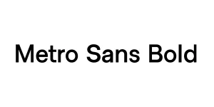
Distancia Heavy Bold
Sans SerifDesigned by Alit Design
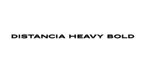
Designed by David Rakowski
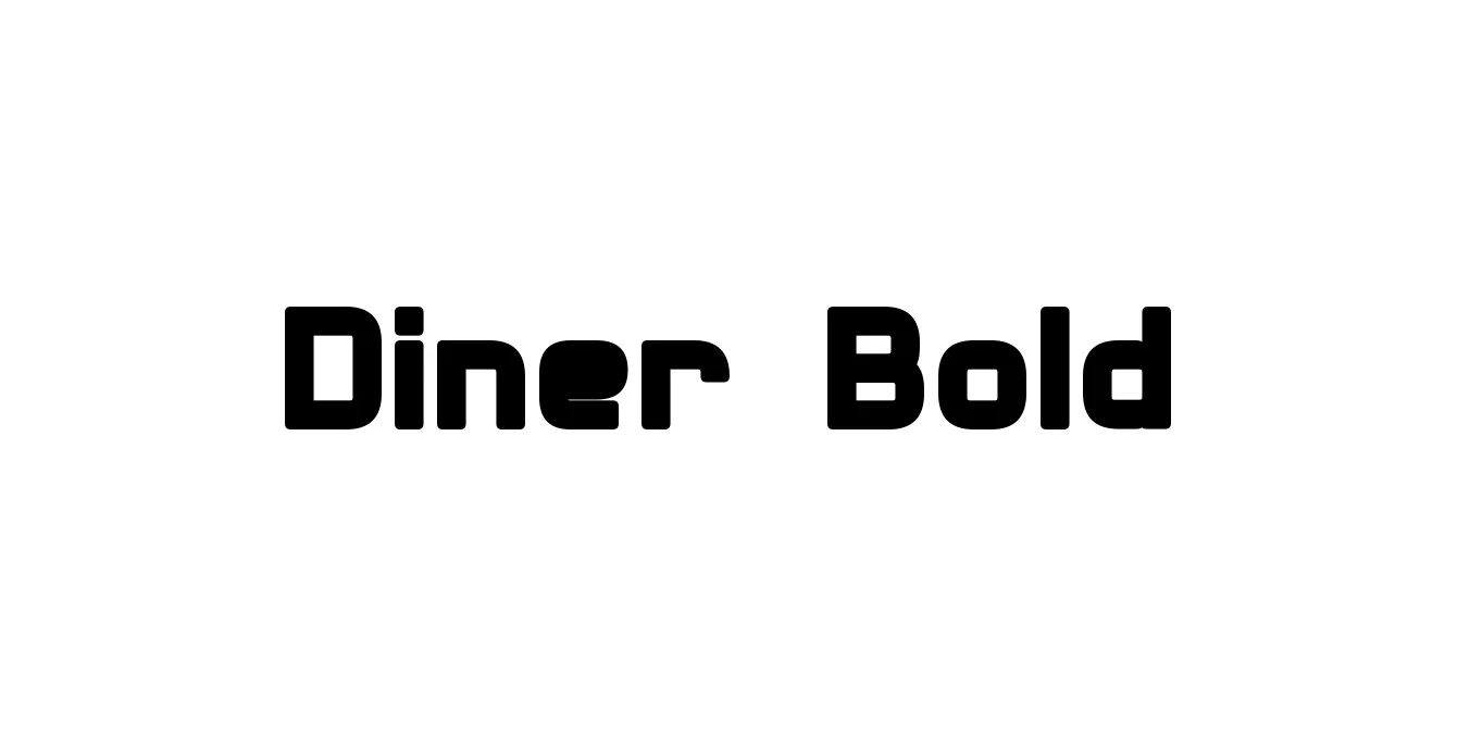
| Font Name | Diner |
| Style | Bold |
| Category | Display / Retro |
| Designer | David Rakowski |
| Copyright | Diner © (Neale Davidson). 2015. All Rights Reserved |
| License | Free for Personal Use |
| Total Character | 242 |
| Recommended Line Height | 1.23 |
| Ascent | 2100 |
| Descent | 418 |
| Units Per em | 2048 |
| Total Vertical Range | 2518 |
| Max Advance Width | 2300 |
| Max Advance Height | N/A |
| Underline Position | -217 |
| Similar Fonts | Avenue, Market Deco, Frontage, Park Lane |
Diner Bold is a classic display typeface created by David Rakowski in the early 1990s. It is heavily inspired by the retro aesthetic of mid-century American diners and Art Deco signage. The font features ultra-condensed, elongated letterforms with a high x-height, successfully capturing the nostalgic "Googie" architecture and neon sign style often found in 1950s-era eateries and motels.
The typeface is characterized by its geometric simplicity and strong vertical emphasis. While the Bold variant offers a heavier weight than the original version, it maintains the sleek, streamlined appearance essential for vintage branding and period-specific designs. It remains a popular choice for graphic designers looking to evoke a sense of Americana or retro-cool elegance in modern digital and print projects.
Perfect for retro-themed branding and classic diner-style restaurant logos.
Great for tall, striking titles on posters, magazines, or book covers.
Ideal for vintage-style product labels and artisanal food packaging.
Works exceptionally well for physical signs and neon-inspired digital graphics.

Designed by Alit Design
Designed by Dmitry Rastvortsev
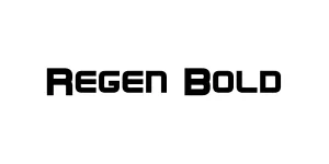
Designed by Zhalgas Kassymkulov

Designed by Yaroslav Zheleznyakov