Distancia Heavy Italic Bold Italic
Sans SerifDesigned by Eko Bimantara
Designed by David Rakowski
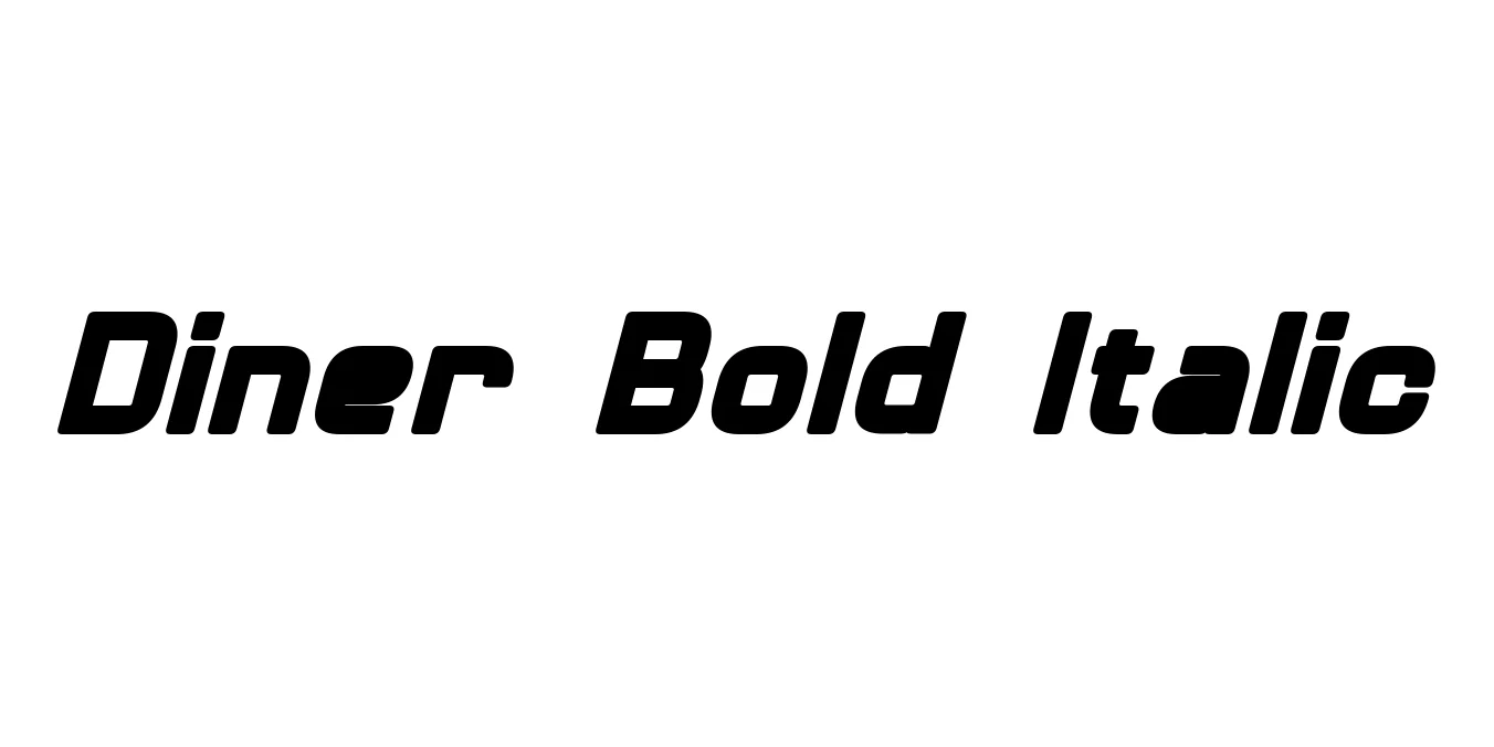
| Font Name | Diner |
| Style | Bold Italic |
| Category | Display / Retro |
| Designer | David Rakowski |
| Copyright | Diner © (Neale Davidson). 2015. All Rights Reserved |
| License | Free for Personal Use |
| Total Character | 242 |
| Recommended Line Height | 1.23 |
| Ascent | 2100 |
| Descent | 418 |
| Units Per em | 2048 |
| Total Vertical Range | 2518 |
| Max Advance Width | 2300 |
| Max Advance Height | N/A |
| Underline Position | -217 |
| Similar Fonts | Market Deco, Bellerose, ITC Anna, Skyline |
Diner Bold Italic is a quintessential display font that captures the vibrant spirit of mid-century Americana. Designed by David Rakowski, this typeface is a bold, slanted interpretation of the classic Art Deco style frequently seen on the neon signs of roadside diners and movie theaters during the 1940s and 1950s. Its extremely high x-height and narrow proportions give it a distinctively tall and sleek appearance that stands out in any visual composition.
The Bold Italic variant specifically adds a sense of motion and urgency to the retro aesthetic, making it an excellent choice for dynamic branding and energetic headlines. While it maintains a minimalist geometric structure, its stylized curves and sharp angles evoke a sense of nostalgia for the Atomic Age. It remains a popular choice for designers looking to inject a vintage yet sophisticated personality into modern digital and print media.
Excellent for creating nostalgic logos for cafes, bars, and retro-themed boutiques.
Perfect for high-impact titles in magazines, posters, and flyers that require a mid-century vibe.
Ideal for eye-catching Instagram graphics and vintage-style promotional banners.
Works beautifully on food and beverage packaging seeking a classic American aesthetic.

Designed by Eko Bimantara
Designed by Crt Sila
Designed by William Addison Dwiggins
Designed by The Northern Block