Affirmative Italic
Sans SerifDesigned by Ray Larabie
Designed by David Rakowski
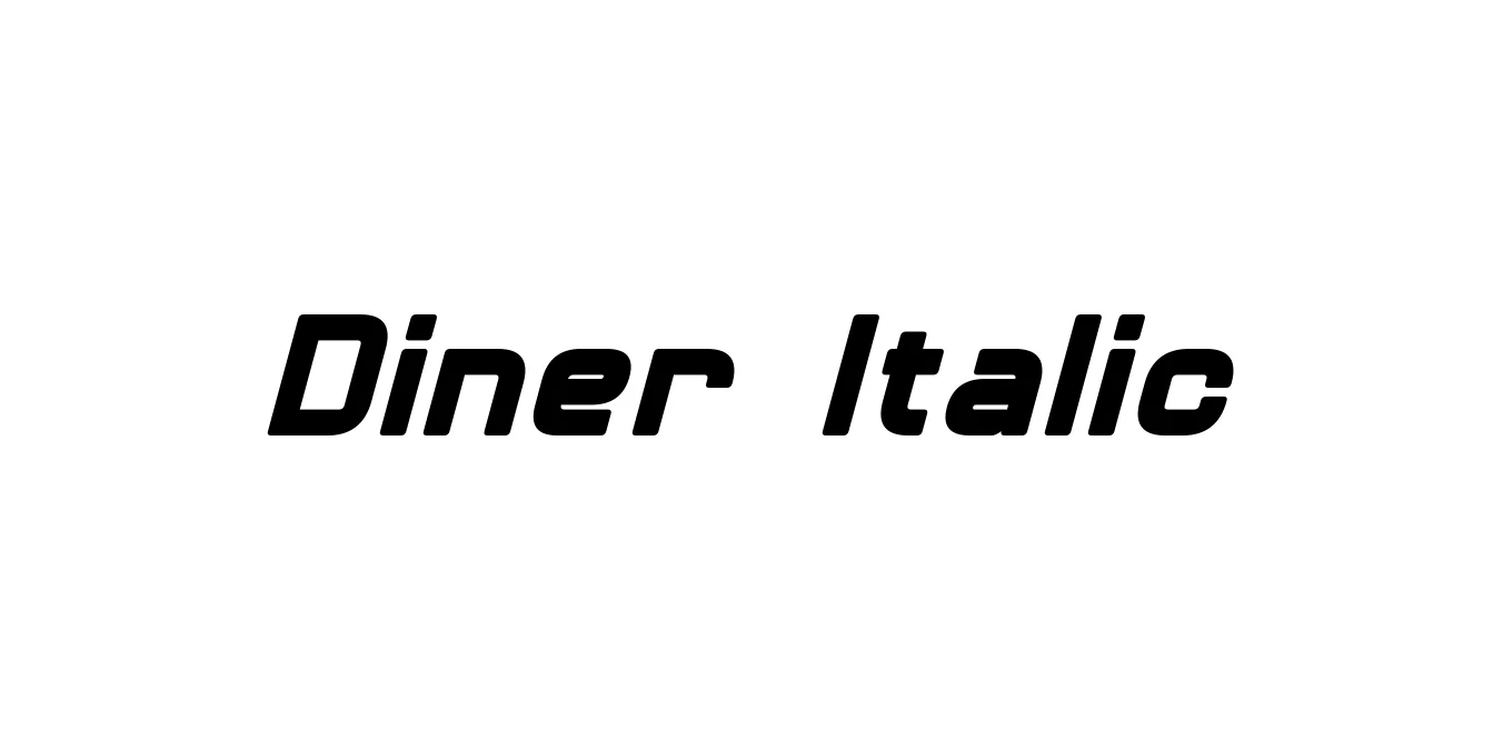
| Font Name | Diner |
| Style | Italic |
| Category | Decorative / Sans Serif |
| Designer | David Rakowski |
| Copyright | Diner © (Neale Davidson). 2015. All Rights Reserved |
| License | Free for Personal Use |
| Total Character | 242 |
| Recommended Line Height | 1.23 |
| Ascent | 2100 |
| Descent | 418 |
| Units Per em | 2048 |
| Total Vertical Range | 2518 |
| Max Advance Width | 2300 |
| Max Advance Height | N/A |
| Underline Position | -217 |
| Similar Fonts | Empire, Bazar, Park Lane, Skyline |
Diner Italic is a stylized, retro typeface designed by David Rakowski in the early 1990s. This font is a quintessential representation of mid-century American diner culture, characterized by its exceptionally tall, thin, and condensed letterforms. The italic version specifically adds a sense of motion and elegance to the geometric structures, capturing the Art Deco and Atomic Age aesthetic that was prevalent in signage and menus during the 1950s.
Because of its narrow width, Diner Italic is highly efficient for space-saving layouts while maintaining a bold, sophisticated visual presence. It is often paired with more substantial sans-serifs to create a hierarchy that feels both vintage and contemporary. The font remains a favorite among graphic designers for nostalgia-themed branding, decorative posters, and specialized editorial headings that require a distinct period-correct look.
Ideal for creating logos and signage for diners, cafes, and vintage-themed eateries.
Perfect for tall headings and categories on menus where horizontal space is limited.
Captures attention in event posters that require a mid-century or nostalgic aesthetic.
Effective for promotional materials that want to evoke the charm of the 1950s era.

Package Size: 31.3 KB
Available Formats: .OTF
Designed by Ray Larabie
Designed by Kimmy Kirkwood

Designed by Situjuh Nazara
Designed by Cosimo Lorenzo Pancini, Maria Chiara Fantini