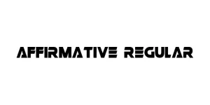
Affirmative Regular
Slab Serif / AthleticDesigned by Zenoz Design
Designed by David Rakowski
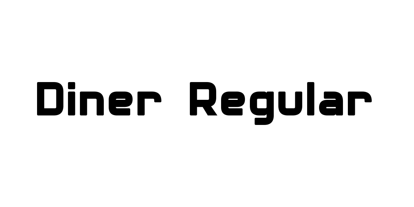
| Font Name | Diner |
| Style | Regular |
| Category | Sans Serif |
| Designer | David Rakowski |
| Copyright | Diner © (Neale Davidson). 2015. All Rights Reserved |
| License | Free for Personal Use |
| Total Character | 242 |
| Recommended Line Height | 1.23 |
| Ascent | 2100 |
| Descent | 418 |
| Units Per em | 2048 |
| Total Vertical Range | 2518 |
| Max Advance Width | 2300 |
| Max Advance Height | N/A |
| Underline Position | -217 |
| Similar Fonts | Market Deco, Metropolis, Broadway, Park Lane |
Diner Regular was designed by David Rakowski in the early 1990s as a nostalgic tribute to the sleek and streamlined aesthetic of mid-century American diner culture. This typeface is defined by its extremely condensed, geometric structure, featuring tall, thin letterforms and rounded edges that mirror the neon signage and chrome accents of the 1950s. The design effectively captures a sense of retro sophistication and playfulness, making it an enduring favorite for projects that require a period-accurate vintage feel.
Over the decades, Diner Regular has become a go-to choice for designers looking to evoke a sense of Americana and Art Deco flair. Its high-waisted letterforms and narrow profile make it highly efficient for display settings where verticality and style are prioritized over long-form readability. Whether used for branding, menus, or cinematic titles, the font remains a powerful tool for conveying a specific historical charm while maintaining a clean, modern digital presence.
Excellent for creating retro-themed logos and identity systems.
Perfect for headers and titles in restaurant and bar menus.
Highly effective for eye-catching event flyers and vintage ads.
Great for artisan food products and retro-style goods.

Designed by Zenoz Design
Designed by Antonio Rodrigues Jr.

Designed by SVN (Style-no.1)
Designed by František Štorm