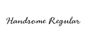
Handsome Regular
ScriptDesigned by Nick Shinn
Designed by David Rakowski
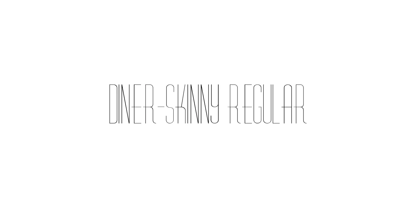
| Font Name | Diner-Skinny |
| Style | Regular |
| Category | Display |
| Designer | David Rakowski |
| Copyright | Diner-Skinny (c) 1992 by David Rakowski. All Rights Reserved. |
| License | Free for Personal Use |
| Total Character | 394 |
| Recommended Line Height | 0.86 |
| Ascent | 819 |
| Descent | 36 |
| Units Per em | 1000 |
| Total Vertical Range | 855 |
| Max Advance Width | 500 |
| Max Advance Height | N/A |
| Underline Position | -80 |
| Similar Fonts | Market Deco, Park Lane NF, Broadway, Steelfish |
Diner-Skinny Regular is a stylized sans-serif typeface that draws heavy inspiration from the iconic Art Deco movement and mid-century American dining aesthetics. Created by renowned type designer David Rakowski, this font is part of the larger Diner family, characterized by its exceptionally tall x-height and narrow proportions. It perfectly captures the nostalgic atmosphere of 1950s diners, neon signs, and vintage chrome architecture, offering a sleek, sophisticated look for display purposes.
The Skinny variant specifically emphasizes the verticality of the letterforms, making it an excellent choice for tight spaces where a strong visual impact is required. Its minimalist strokes and high-waisted geometry reflect a classic era of graphic design while remaining versatile enough for modern minimalist projects. Whether used for branding or editorial layouts, Diner-Skinny Regular provides a unique retro charm that is both elegant and distinctive.
Ideal for restaurant menus aiming for a classic 50s diner aesthetic.
Perfect for sophisticated, tall wordmarks in the fashion or food industry.
Great for vintage-themed event posters and tall, vertical compositions.
Works well for high-impact titles in magazines or digital blogs.

Designed by Nick Shinn
Designed by Letterhend Studio

Designed by Identity-Letters (Dmitry Rastvortsev)
Designed by Mariya V. Pigoulevskaya