Domaine Display Medium Italic
Designed by Kris Sowersby
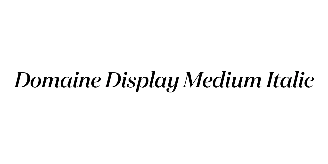
| Font Name | Test Domaine Display Medium |
| Style | Italic |
| Category | Serif |
| Designer | Kris Sowersby |
| Copyright | Copyright 2024, Kris Sowersby, Klim Type Foundry. |
| License | Free for Personal Use / Demo |
| Total Character | 66 |
| Recommended Line Height | 1.31 |
| Ascent | 1030 |
| Descent | 280 |
| Units Per em | 1000 |
| Total Vertical Range | 1310 |
| Max Advance Width | 1203 |
| Max Advance Height | N/A |
| Underline Position | -41 |
| Similar Fonts | Caslon, De Vinne, Miller Display, Austin, Chronicle Display |
Domaine Display Medium Italic Font Details : Font Free Download
Domaine Display Medium Italic is a contemporary serif typeface designed by the renowned Kris Sowersby and released through his Klim Type Foundry in 2014. It is part of the larger Domaine family, which explores the historical 'Latin' genre, specifically drawing inspiration from the 19th-century 'De Vinne' style. By combining the elegance of traditional French and Scotch serifs with modern digital precision, Sowersby created a high-contrast display face that feels both timeless and current.
The Medium Italic weight is particularly notable for its fluid, calligraphic grace and sharp, needle-like terminals. It manages to balance a heavy historical influence with a sleek, fashion-forward aesthetic, making it an essential tool for high-end editorial work. Its distinct lean and sophisticated stroke modulation ensure that it stands out in large-scale applications such as headlines and brand identities, where its intricate details can be fully appreciated.
Domaine Display Medium Italic Best Uses
Ideal for magazine mastheads, feature article headers, and sophisticated pull-quotes.
Perfect for high-end logos, perfume packaging, and boutique fashion labels.
Adds a premium feel to hero sections and landing page titles for luxury digital experiences.
Domaine Display Medium Italic Glyphs
