Domaine Display Narrow Bold
Designed by Kris Sowersby
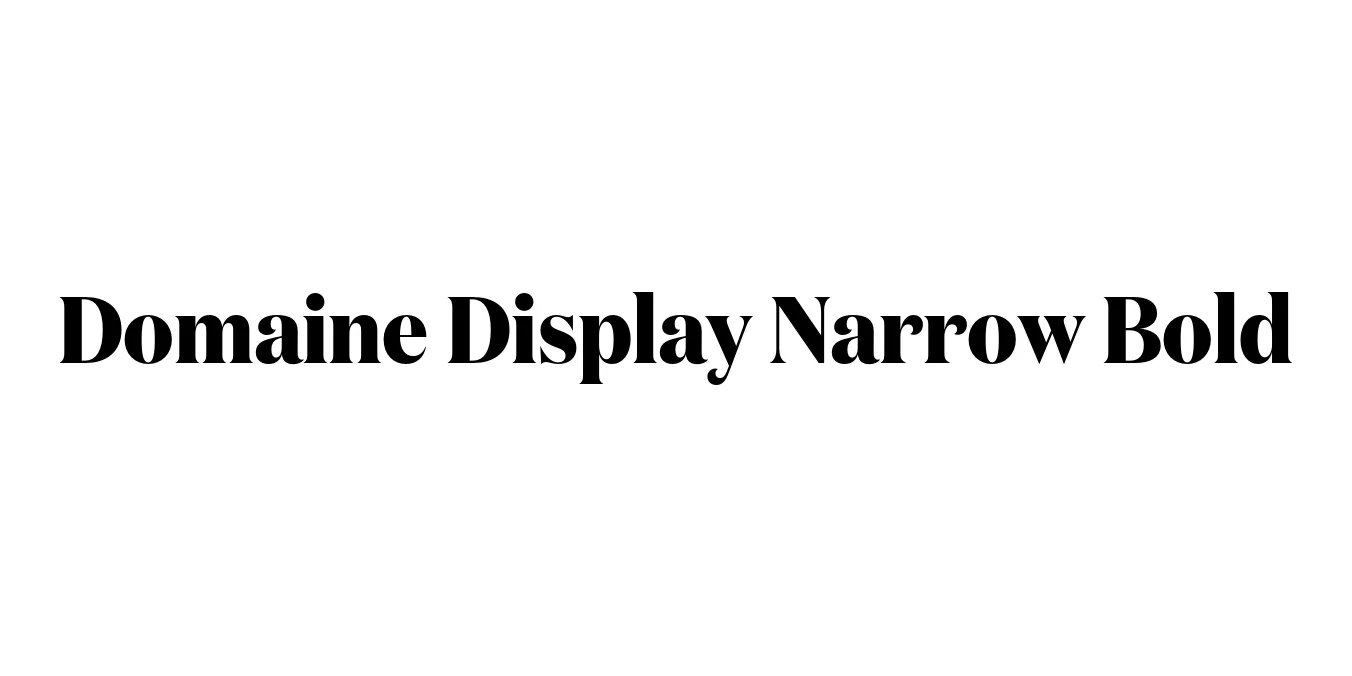
| Font Name | Test Domaine Display Narrow |
| Style | Bold |
| Category | Serif |
| Designer | Kris Sowersby |
| Copyright | Copyright 2024, Kris Sowersby, Klim Type Foundry. |
| License | Demo |
| Total Character | 66 |
| Recommended Line Height | 1.31 |
| Ascent | 1030 |
| Descent | 280 |
| Units Per em | 1000 |
| Total Vertical Range | 1310 |
| Max Advance Width | 1203 |
| Max Advance Height | N/A |
| Underline Position | -37 |
| Similar Fonts | Tiempos Headline, Austin, Chronicle Display, Caslon Graphique |
Domaine Display Narrow Bold Font Details : Font Free Download
Domaine Display Narrow Bold is a sophisticated serif typeface designed by Kris Sowersby and released through the Klim Type Foundry in 2013. The family originated from a project for the redesign of L'Officiel magazine, evolving from a custom typeface into a comprehensive collection. It blends the historical elegance of 19th-century Latin typefaces with a sharp, contemporary edge, characterized by its high contrast and dramatic flourishes.
The Narrow Bold weight is specifically engineered for high-impact display use where horizontal space is at a premium. Its vertical stress and sharp serifs create a rhythmic, luxurious aesthetic that has become a hallmark of modern editorial design. It is widely recognized for its ability to convey authority and elegance simultaneously, making it a favorite among creative directors in the fashion and lifestyle sectors.
Domaine Display Narrow Bold Best Uses
Perfect for magazine mastheads and high-fashion feature headlines.
Excellent for luxury identity systems and sophisticated logo marks.
Ideal for premium promotional posters and large-scale display signage.
Great for striking hero sections and elegant titles on high-end portfolios.
Domaine Display Narrow Bold Glyphs
