Domaine Display Semibold Italic
Designed by Kris Sowersby
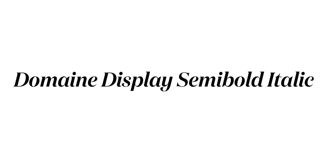
| Font Name | Test Domaine Display Semibold |
| Style | Italic |
| Category | Serif |
| Designer | Kris Sowersby |
| Copyright | Copyright 2024, Kris Sowersby, Klim Type Foundry. |
| License | Commercial License Required |
| Total Character | 66 |
| Recommended Line Height | 1.31 |
| Ascent | 1030 |
| Descent | 280 |
| Units Per em | 1000 |
| Total Vertical Range | 1310 |
| Max Advance Width | 1211 |
| Max Advance Height | N/A |
| Underline Position | -41 |
| Similar Fonts | Austin, Chronicle Display, Caslon |
Domaine Display Semibold Italic Font Details : Font Free Download
Domaine Display Semibold Italic was designed by Kris Sowersby and released through the Klim Type Foundry in 2013. The typeface is a contemporary exploration of the 'Latin' style, which is characterized by triangular serifs and sharp, high-contrast terminals. It draws inspiration from the archival 19th-century specimens of Deberny & Peignot, blending historical elegance with modern precision to create a versatile family suited for high-end display environments.
The Semibold Italic weight specifically offers a sophisticated balance of strength and fluid motion. Its distinct curves and sharp detailing make it a favorite for editorial designers looking for a typeface that commands attention while maintaining a sense of refined luxury. This font thrives in large-scale applications where its intricate craftsmanship and rhythmic italic forms can be fully appreciated.
Domaine Display Semibold Italic Best Uses
Perfect for magazine headlines and feature spreads.
Ideal for luxury brands and high-end identity systems.
Highly suited for beauty and apparel marketing materials.
Adds a sophisticated touch to premium product labels.
Captures attention in both web and print title sequences.
Domaine Display Semibold Italic Glyphs
