Earthbound Condensed Bold
Designed by Typical
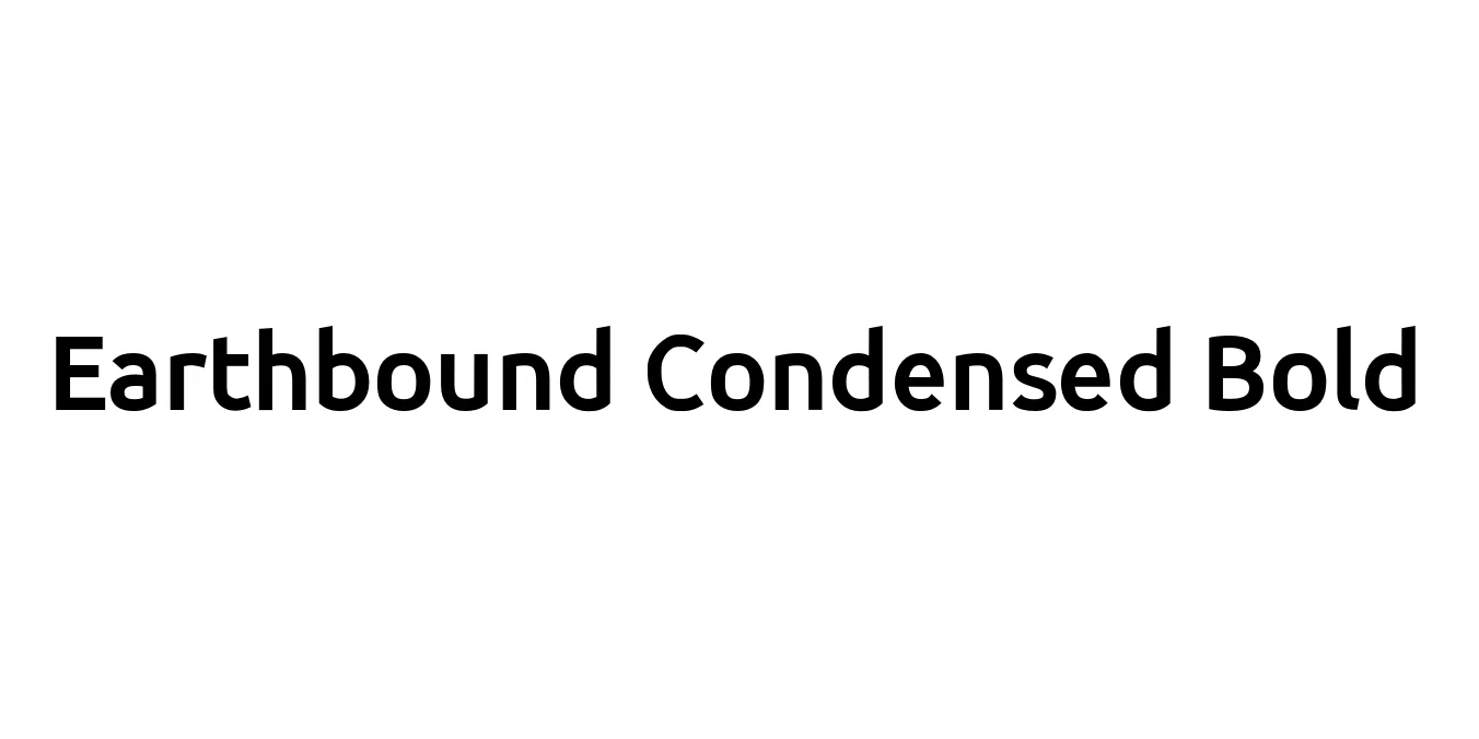
| Font Name | Earthbound |
| Style | Condensed Bold |
| Category | Bitmap / Pixel |
| Designer | Typical |
| Copyright | Copyright (c) 2013 by Richard Alexander Hall. |
| License | Free for Personal Use |
| Total Character | 113 |
| Recommended Line Height | 1 |
| Ascent | 800 |
| Descent | 202 |
| Units Per em | 1000 |
| Total Vertical Range | 1002 |
| Max Advance Width | 893 |
| Max Advance Height | N/A |
| Underline Position | -123 |
| Similar Fonts | Apple Kid, Chicago, PF Tempesta Seven |
Earthbound Condensed Bold Font Details : Font Free Download
Earthbound Condensed Bold is a specialized typeface deeply rooted in the aesthetic of the 1994 cult classic SNES RPG, EarthBound (Mother 2). Originally conceived as a functional pixel font to maximize readability on low-resolution cathode-ray tube televisions, this condensed bold variation captures the whimsical yet slightly offbeat personality of the game's interface. It features tight horizontal spacing and thick, blocky letterforms that evoke a powerful sense of mid-90s digital nostalgia.
In the modern design era, the font has transitioned from a niche gaming asset to a popular choice for retro-themed digital projects and indie game development. Its unique geometry and high-contrast weight make it exceptionally effective for headers and titles where space is limited but visual impact is required. While it remains a staple for the gaming community, its clean, grid-based structure allows it to function seamlessly in modern minimalist layouts seeking a tech-vintage or vaporwave flair.
Earthbound Condensed Bold Best Uses
Ideal for inventory systems, dialogue boxes, and retro-style interfaces.
Perfect for t-shirt designs and stickers targeting the gaming and pixel art community.
Provides a high-impact, compact look for digital banners and social media graphics.
Earthbound Condensed Bold Glyphs
