Edge Display Bold
Designed by Bram de Haan
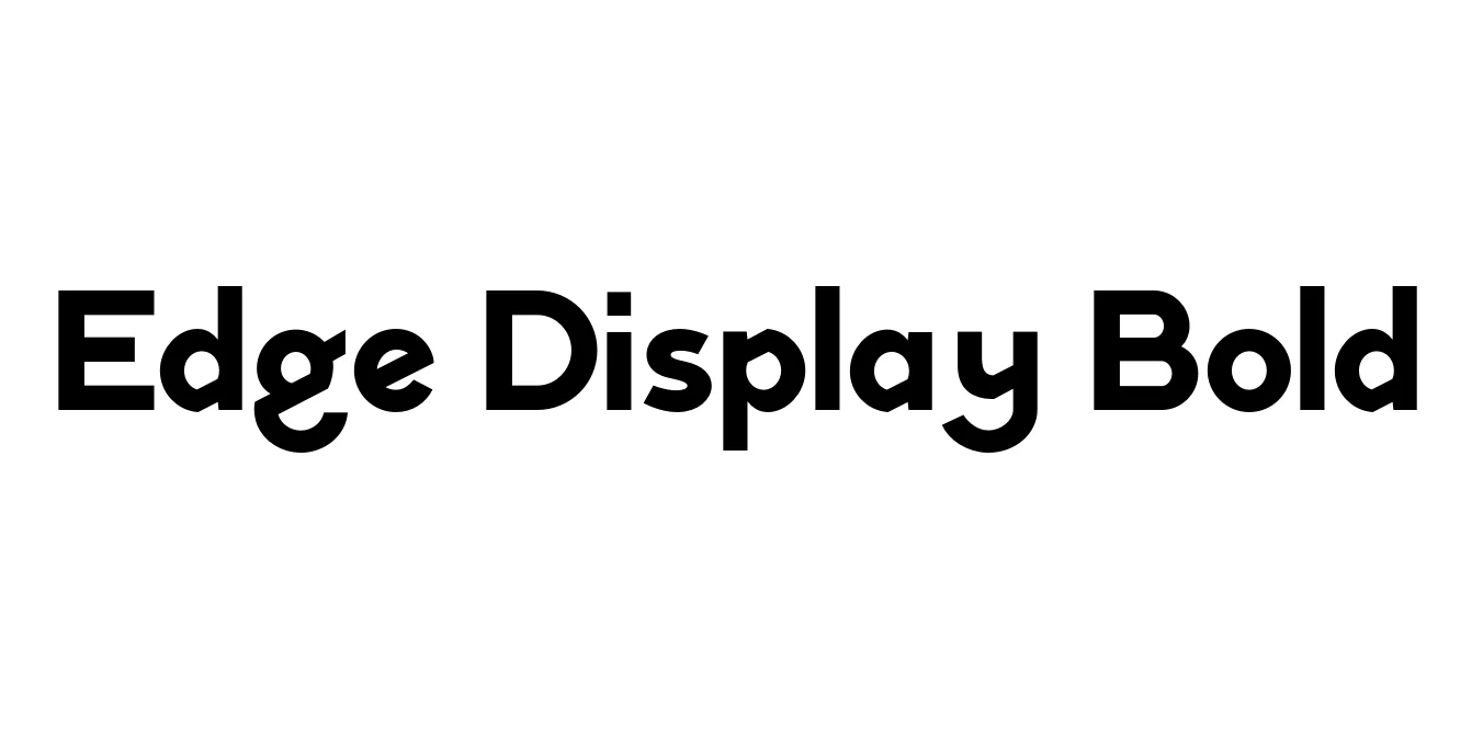
| Font Name | Edge Display |
| Style | Bold |
| Category | Display Sans Serif |
| Designer | Bram de Haan |
| Copyright | © 2017-2020 Grzegorz Samson |
| License | Free for Personal Use |
| Total Character | 309 |
| Recommended Line Height | 0.99 |
| Ascent | 930 |
| Descent | 320 |
| Units Per em | 1260 |
| Total Vertical Range | 1250 |
| Max Advance Width | 1531 |
| Max Advance Height | N/A |
| Underline Position | -194 |
| Similar Fonts | Montserrat, Futura, Gotham, Neutraface |
Edge Display Bold Font Details : Font Free Download
Edge Display Bold is a striking contemporary typeface designed to command attention through its sharp, geometric construction and high-contrast stroke terminals. It belongs to a larger family designed for high-impact visual communication, blending modernist aesthetics with a digital-first approach. The bold weight specifically emphasizes power and stability, making it a favorite for designers working on cutting-edge technology brands and editorial layouts.
The history of this font is rooted in the need for high-legibility display faces that do not sacrifice personality. By utilizing unique angular cuts and a robust x-height, Edge Display Bold ensures that even at large scales, every character maintains a distinct, professional presence. It has evolved into a versatile tool for sports branding, automotive industries, and architectural signage where a sense of forward-moving momentum is required.
Edge Display Bold Best Uses
Ideal for logo designs that require a strong, industrial, or tech-centric identity.
Perfect for high-impact titles in magazines and digital articles.
Great for large-scale print materials where clarity and style are paramount.
Suitable for hero sections and call-to-action buttons to grab user attention.
Edge Display Bold Glyphs
