Frutiger Neue LT W1G Italic
Designed by Adrian Frutiger, Akira Kobayashi
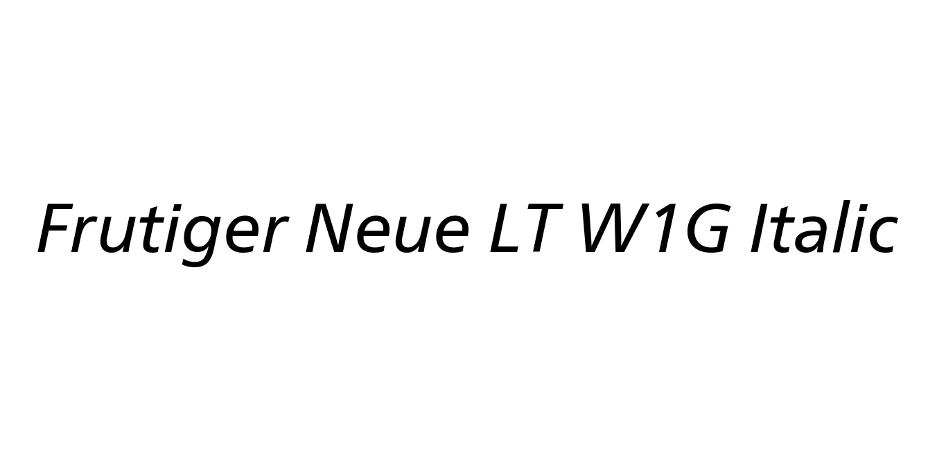
| Font Name | Frutiger Neue LT W1G |
| Style | Italic |
| Category | Sans Serif |
| Designer | Adrian Frutiger, Akira Kobayashi |
| Copyright | Copyright © 2010 Linotype Corp., www.linotype.com. All rights reserved. This font software may not be reproduced, modified, disclosed or transferred without the express written approval of Linotype Corp. Frutiger is a trademark of Linotype Corp. registered in the U.S. Patent and Trademark Office and may be registered in certain other jurisdictions in the name of Linotype Corp. or its licensee Linotype GmbH. This typeface is original artwork of Adrian Frutiger and Linotype Design Studio. The design may be protected in certain jurisdictions. |
| License | Commercial (License Required) |
| Total Character | 598 |
| Recommended Line Height | 1.2 |
| Ascent | 962 |
| Descent | 240 |
| Units Per em | 1000 |
| Total Vertical Range | 1202 |
| Max Advance Width | 1251 |
| Max Advance Height | N/A |
| Underline Position | -175 |
| Similar Fonts | Myriad Pro, Univers, Segoe UI, Open Sans, PT Sans |
Frutiger Neue LT W1G Italic Font Details : Font Free Download
Frutiger Neue LT W1G Italic is a refined evolution of the iconic Frutiger typeface, which was originally developed in the early 1970s for the Charles de Gaulle Airport wayfinding system. Created by the legendary Adrian Frutiger, the family was designed to bridge the gap between the rigid geometry of Univers and the organic nature of Gill Sans. This specific version, the 'Neue' or 'Next' iteration, was a collaboration between Frutiger and Akira Kobayashi to optimize the family for modern digital environments and expansive multi-language support.
The W1G designation indicates the 'World Glyph' character set, covering a wide array of languages and OpenType features. Unlike the original Frutiger which utilized oblique (slanted) styles, the Neue Frutiger Italic features a true italic design, offering a more cursive and distinct flow that enhances editorial hierarchy. It remains a global standard for legibility, used extensively in signage, corporate branding, and complex information design due to its open apertures and balanced proportions.
Frutiger Neue LT W1G Italic Best Uses
Exceptional clarity for signage in airports, hospitals, and transit hubs.
Ideal for professional brand guidelines and international business communications.
Maintains high readability on high-resolution screens and small mobile displays.
The true italic style provides excellent emphasis for body text and pull quotes.
Frutiger Neue LT W1G Italic Glyphs

Download Font
Package Size: 302.6 KB
Available Formats: .TTF, .WOFF, .WOFF2, .EOT