FSP - Futura Italic
Designed by Paul Renner
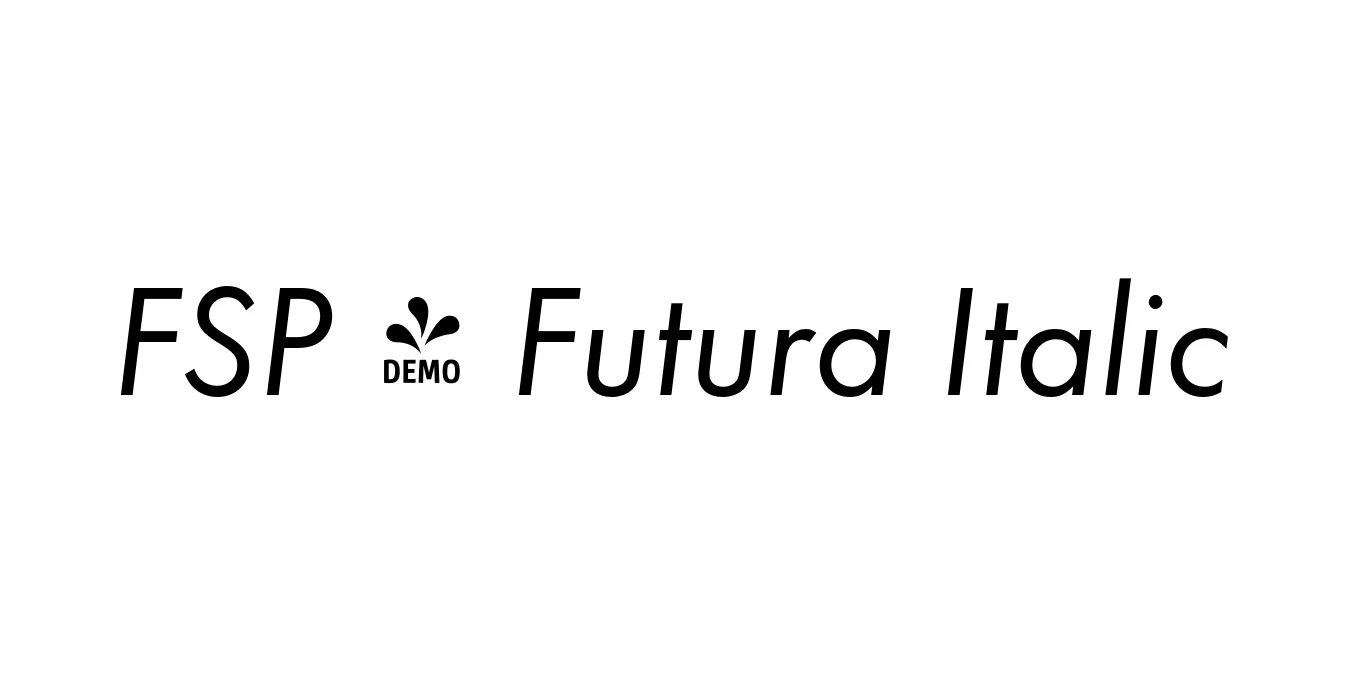
| Font Name | FSP DEMO - Futura |
| Style | Italic |
| Category | Geometric Sans-Serif |
| Designer | Paul Renner |
| Copyright | Copyright 2010 by (URW)++ Design & Development GmbH |
| License | Free for Personal Use |
| Total Character | 95 |
| Recommended Line Height | 1.26 |
| Ascent | 1008 |
| Descent | 250 |
| Units Per em | 1000 |
| Total Vertical Range | 1258 |
| Max Advance Width | 914 |
| Max Advance Height | N/A |
| Underline Position | -133 |
| Similar Fonts | Spartan, ITC Avant Garde Gothic, Montserrat, Gill Sans |
FSP - Futura Italic Font Details : Font Free Download
Futura was originally designed by Paul Renner in 1927 and is recognized as the quintessential geometric sans-serif typeface. Created as a contribution to the New Frankfurt project, it was influenced by the Bauhaus design philosophy, emphasizing efficiency and forward-thinking modernism. The font is constructed using near-perfect circles, triangles, and squares, intentionally avoiding the calligraphic and decorative elements seen in traditional serif and grotesque fonts of that era.
The FSP - Futura Italic variant serves as a sophisticated oblique counterpart to the Roman weights. Rather than adopting cursive or handwritten forms common in serif italics, it maintains the rigid geometric structure of the original typeface, simply slanting the characters to provide emphasis and a sense of motion. This makes it an invaluable tool for professional designers looking for a typeface that embodies clarity, corporate authority, and timeless elegance in both print and digital mediums.
FSP - Futura Italic Best Uses
Used by major global brands for professional and timeless corporate identities.
Perfect for high-impact slogans and minimalist poster designs.
Excellent for subheaders, captions, and pull quotes in high-end magazines.
Provides a clean and legible aesthetic for modern websites and application menus.
FSP - Futura Italic Glyphs
