FSP - FuturaDem Italic
Designed by Paul Renner
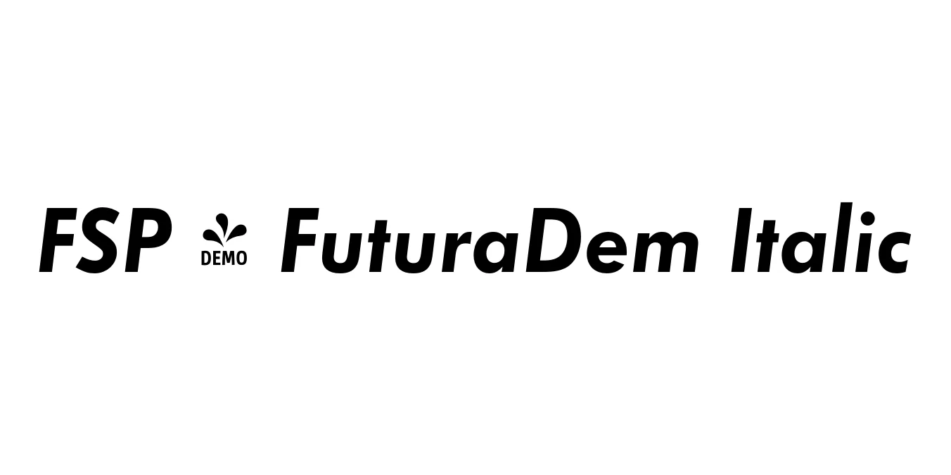
| Font Name | FSP DEMO - FuturaDem |
| Style | Italic |
| Category | Geometric Sans Serif |
| Designer | Paul Renner |
| Copyright | Copyright 2010 by (URW)++ Design & Development GmbH |
| License | Demo / Commercial License Required |
| Total Character | 95 |
| Recommended Line Height | 1.27 |
| Ascent | 1024 |
| Descent | 250 |
| Units Per em | 1000 |
| Total Vertical Range | 1274 |
| Max Advance Width | 878 |
| Max Advance Height | N/A |
| Underline Position | -162 |
| Similar Fonts | Futura, Avenir, Montserrat, Century Gothic, ITC Avant Garde Gothic |
FSP - FuturaDem Italic Font Details : Font Free Download
FSP - FuturaDem Italic is a refined iteration of the classic Futura typeface, originally developed by the legendary designer Paul Renner between 1924 and 1926. Rooted in the Bauhaus philosophy that form should follow function, this geometric sans-serif avoids all decorative elements, relying instead on fundamental shapes like the circle, square, and triangle. The Demi Italic weight serves as a bridge between medium and bold, providing a sophisticated slant that adds motion and emphasis without sacrificing the font's signature stability.
This specific version, optimized for digital use, retains the high-quality kerning and mathematical precision that made the original Futura a favorite for the 20th-century avant-garde. The FuturaDem Italic variant is particularly praised for its legibility and modern aesthetic, making it an enduring choice for designers who require a professional look that communicates both heritage and forward-thinking innovation.
FSP - FuturaDem Italic Best Uses
Ideal for creating timeless and minimalist corporate identities.
Perfect for subheadings and pull quotes in high-end magazines.
Excellent for clean, high-impact headers and navigation menus.
Effective for clear, authoritative messaging in print and digital ads.
FSP - FuturaDem Italic Glyphs

Download Font
Package Size: 14.9 KB
Available Formats: .OTF