FSP - Vivala G-Slab Bold Regular
Designed by Joana Correia
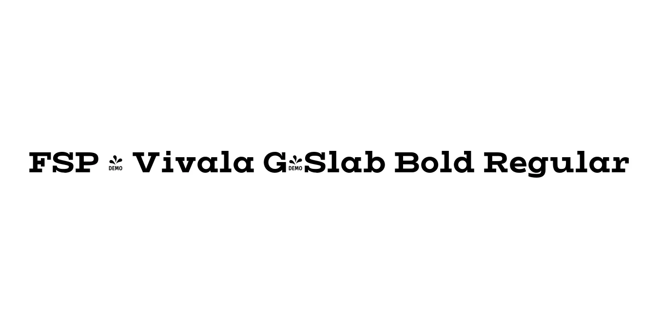
| Font Name | FSP DEMO - Vivala G-Slab Bold |
| Style | Regular |
| Category | Slab Serif |
| Designer | Joana Correia |
| Copyright | Copyright 2022 by Johannes Hoffmann. All rights reserved. |
| License | Free for Personal Use |
| Total Character | 95 |
| Recommended Line Height | 1.2 |
| Ascent | 1000 |
| Descent | 200 |
| Units Per em | 1000 |
| Total Vertical Range | 1200 |
| Max Advance Width | 1404 |
| Max Advance Height | N/A |
| Underline Position | -100 |
| Similar Fonts | Archer, Museo Slab, Sentinel, Rockwell |
FSP - Vivala G-Slab Bold Regular Font Details : Font Free Download
Vivala G-Slab Bold Regular is a prominent member of the Vivala G superfamily, designed by the renowned typographer Joana Correia. This typeface represents a sophisticated blend of geometric structures and humanistic proportions, specifically engineered to provide a robust yet approachable aesthetic. The Bold weight emphasizes the slab-serif characteristics, making it an excellent choice for designers looking for a typeface that commands attention without sacrificing readability.
The development of the Vivala G-Slab series was driven by the need for a versatile slab-serif that could bridge the gap between technical precision and organic warmth. With its generous x-height and sturdy terminals, the font excels in high-pressure environments like editorial headlines and corporate identities. It serves as the perfect companion to its sans-serif counterpart, offering a cohesive visual language for complex typographic hierarchies in both digital and print media.
FSP - Vivala G-Slab Bold Regular Best Uses
Perfect for bold, impactful titles in magazines and on posters.
Ideal for creating strong, dependable visual identities for modern companies.
Highly legible for hero sections and prominent call-to-action buttons.
Sturdy enough for high-quality brochures, annual reports, and advertising.
FSP - Vivala G-Slab Bold Regular Glyphs
