Futura Condensed Bold Italic
Designed by Paul Renner
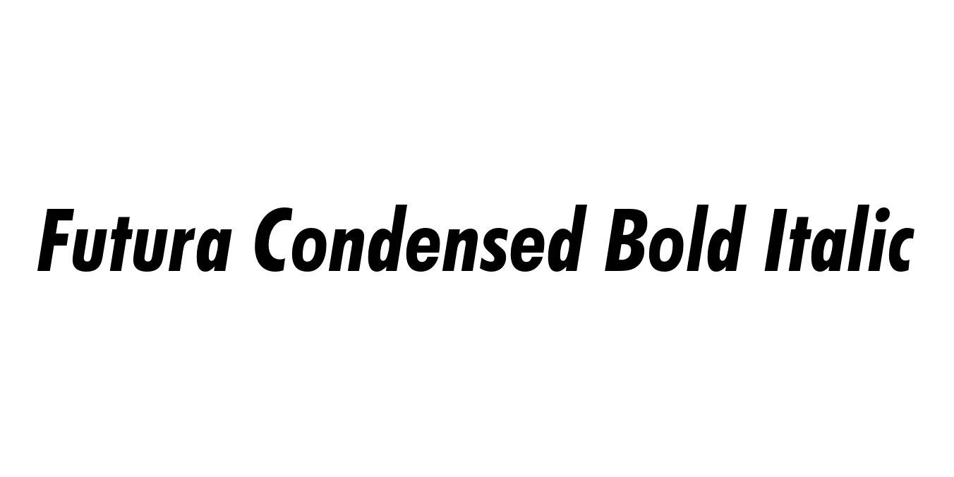
| Font Name | Futura Condensed |
| Style | Bold Italic |
| Category | Sans-serif |
| Designer | Paul Renner |
| Copyright | Copyright 1990 as an unpublished work by Bitstream Inc. All rights reserved. Confidential. |
| License | Free for Personal Use |
| Total Character | 228 |
| Recommended Line Height | 1.2 |
| Ascent | 963 |
| Descent | 239 |
| Units Per em | 1000 |
| Total Vertical Range | 1202 |
| Max Advance Width | 1058 |
| Max Advance Height | N/A |
| Underline Position | -109 |
| Similar Fonts | Avenir Next, Spartan MB, Gotham, Gill Sans Condensed |
Futura Condensed Bold Italic Font Details : Font Free Download
Futura was originally designed by the German typeface designer Paul Renner in 1927 and remains the quintessential example of a geometric sans-serif. Commissioned by the Bauer Type Foundry, it was conceived as a contribution to the New Frankfurt project and was heavily influenced by the Bauhaus design philosophy. Its forms are based on simple geometric shapes—the circle, triangle, and square—eliminating unnecessary decorative elements to achieve a purely functional and modern aesthetic.
The Futura Condensed Bold Italic variation serves as a high-impact, space-saving tool for designers. It maintains the signature clarity and geometric precision of the original family while adding a forward-leaning slant that conveys energy and speed. This specific weight is widely celebrated in cinematic typography, corporate identity systems, and editorial design for its ability to command attention without occupying excessive horizontal real estate.
Futura Condensed Bold Italic Best Uses
Perfect for high-impact titles where horizontal space is at a premium.
Ideal for logos that need to look fast, modern, and authoritative.
Great for posters and billboards requiring bold, legible messaging.
Frequently used for dynamic graphics and jersey numbers due to its sleek profile.
Futura Condensed Bold Italic Glyphs
