Galderglynn Titling Light Regular
Designed by Ray Larabie
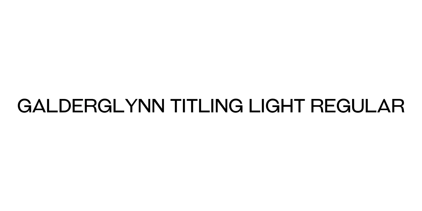
| Font Name | Galderglynn Titling Light |
| Style | Regular |
| Category | Sans Serif |
| Designer | Ray Larabie |
| Copyright | © 2010-2024 Typodermic Fonts Inc. |
| License | Free for Personal Use |
| Total Character | 498 |
| Recommended Line Height | 1.2 |
| Ascent | 957 |
| Descent | 243 |
| Units Per em | 1000 |
| Total Vertical Range | 1200 |
| Max Advance Width | 1288 |
| Max Advance Height | N/A |
| Underline Position | -75 |
| Similar Fonts | Franklin Gothic, News Gothic, Trade Gothic |
Galderglynn Titling Light Regular Font Details : Font Free Download
Galderglynn Titling Light Regular is a refined sans-serif typeface created by Ray Larabie of Typodermic Fonts. Drawing inspiration from the robust and clear typographic styles of early 20th-century American news headlines, this font offers a sophisticated balance between historical gravitas and modern minimalism. The Light Regular weight specifically provides an elegant, airy quality that allows for high-impact display usage without the visual weight of traditional headline fonts.
The typeface is characterized by its slightly condensed proportions and sharp, precise geometry. Designed specifically for titling and display purposes, it excels in environments where clarity and an authoritative tone are required. Its clean lines and balanced spacing make it a versatile tool for designers aiming to capture a vintage editorial aesthetic while maintaining a crisp, contemporary feel on both digital screens and high-resolution print.
Galderglynn Titling Light Regular Best Uses
Perfect for magazine headlines, newspaper mastheads, and pull quotes.
Excellent for minimalist logos and luxury brand identities.
Ideal for professional website headers and clean landing page titles.
Suitable for high-end brochures, book covers, and event posters.
Galderglynn Titling Light Regular Glyphs
