Galderglynn Titling Thin Italic
Designed by Ray Larabie
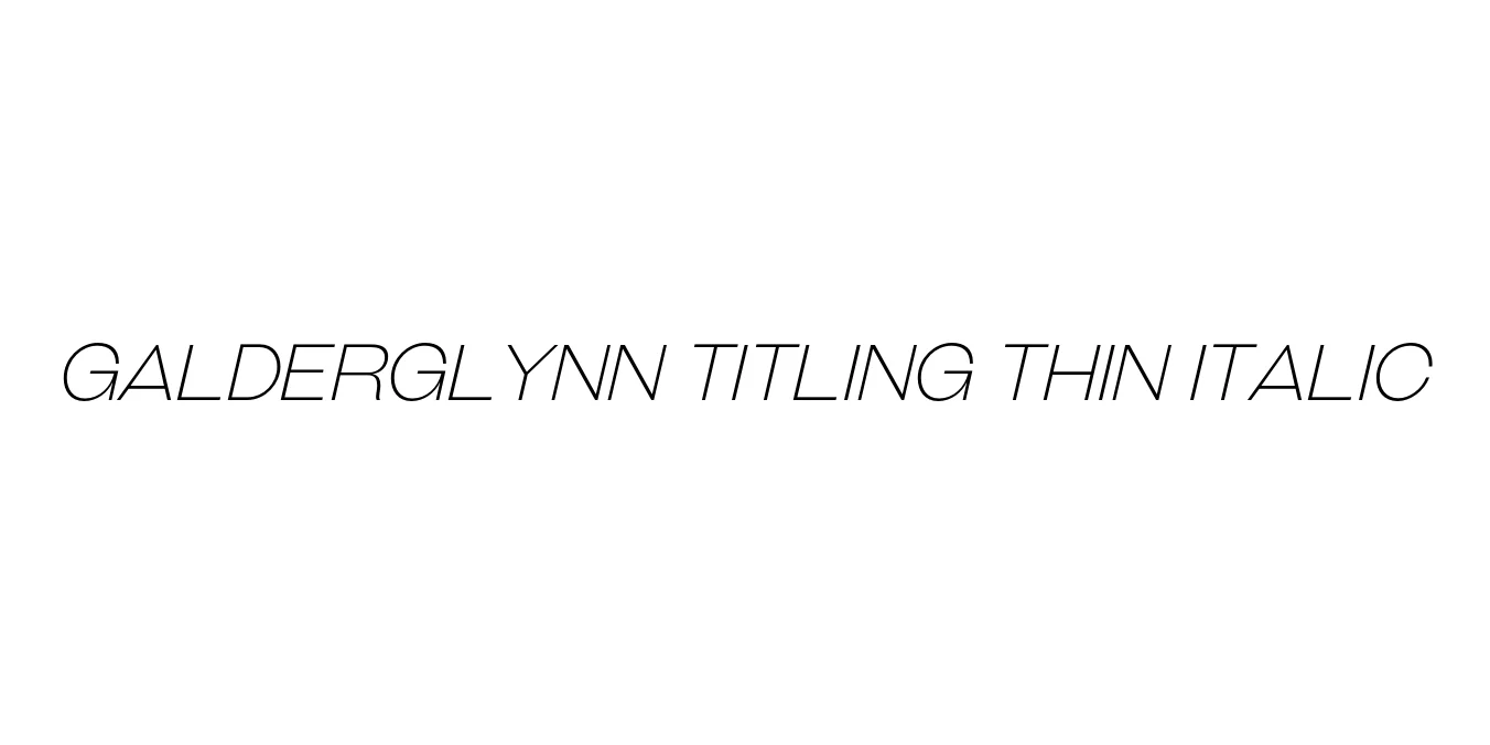
| Font Name | Galderglynn Titling Thin |
| Style | Italic |
| Category | Sans-serif |
| Designer | Ray Larabie |
| Copyright | © 2010-2024 Typodermic Fonts Inc. |
| License | Free for Personal Use |
| Total Character | 498 |
| Recommended Line Height | 1.2 |
| Ascent | 957 |
| Descent | 243 |
| Units Per em | 1000 |
| Total Vertical Range | 1200 |
| Max Advance Width | 1344 |
| Max Advance Height | N/A |
| Underline Position | -75 |
| Similar Fonts | Steelfish, League Gothic, Bebas Neue, Helvetica Compressed |
Galderglynn Titling Thin Italic Font Details : Font Free Download
Galderglynn Titling Thin Italic is a distinguished member of the Galderglynn Titling family, designed by the prolific typographer Ray Larabie of Typodermic Fonts. This typeface takes its inspiration from the narrow, condensed sans-serif styles prominent in early 20th-century American advertising and publication headers. It is characterized by its mechanical precision and vertically elongated forms, which provide a clean and sophisticated aesthetic for high-impact visual communication.
The Thin Italic weight specifically offers a delicate yet sharp presence on the page, blending modern minimalism with a hint of retro-industrial flair. Its slant adds a sense of motion and elegance, making it particularly effective for high-end editorial layouts, luxury branding, and digital interfaces where space is at a premium. This font is a preferred choice for designers who require a condensed face that maintains exceptional legibility and professional polish.
Galderglynn Titling Thin Italic Best Uses
Perfect for tall and narrow headlines in editorial and magazine layouts.
Ideal for sleek, minimalist logos and high-end luxury brand identity.
Great for vertical text emphasis and impactful promotional graphics.
Excellent for stylish hero sections and modern UI elements.
Galderglynn Titling Thin Italic Glyphs
