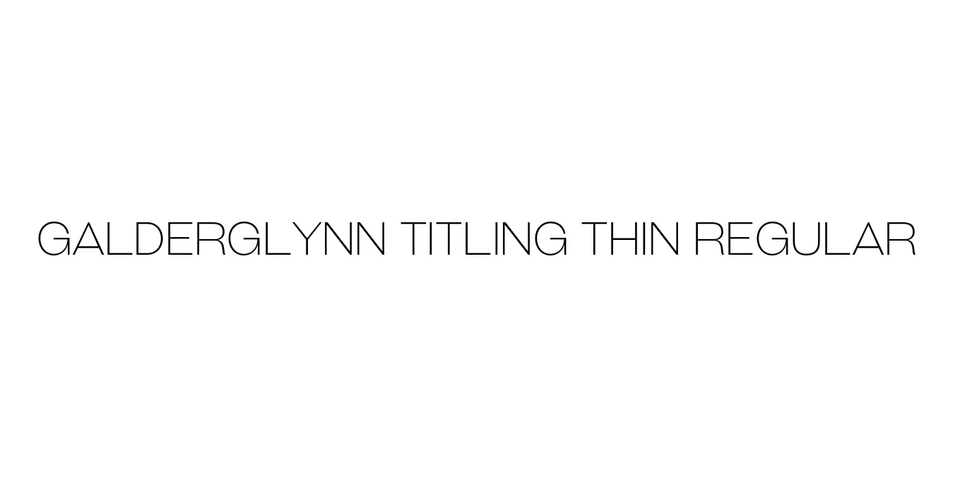
Galderglynn Titling Thin Regular
Designed by Ray Larabie
| Font Name | Galderglynn Titling Thin |
| Style | Regular |
| Category | Sans Serif |
| Designer | Ray Larabie |
| Copyright | © 2010-2024 Typodermic Fonts Inc. |
| License | Free for Personal Use |
| Total Character | 498 |
| Recommended Line Height | 1.2 |
| Ascent | 957 |
| Descent | 243 |
| Units Per em | 1000 |
| Total Vertical Range | 1200 |
| Max Advance Width | 1344 |
| Max Advance Height | N/A |
| Underline Position | -75 |
| Similar Fonts | Akzidenz-Grotesk, Helvetica, News Gothic, Franklin Gothic |
Galderglynn Titling Thin Regular Font Details : Font Free Download
Galderglynn Titling is a sophisticated sans-serif typeface designed by Ray Larabie of Typodermic Fonts. Drawing inspiration from the robust Grotesque fonts of the late 19th and early 20th centuries, this family bridges the gap between historical industrial aesthetics and contemporary digital precision. The design emphasizes a tall x-height and clean, structured terminals, providing a professional and commanding presence suitable for high-end typographic work.
The Thin Regular weight specifically highlights the font's architectural elegance, offering a delicate yet legible stroke that excels in minimalist environments. It is a favored choice for designers seeking an alternative to standard neo-grotesques, providing a unique personality that remains neutral enough for corporate applications. Whether used in high-fashion branding or editorial layouts, Galderglynn Titling maintains its integrity and modern appeal.
Galderglynn Titling Thin Regular Best Uses
Perfect for luxury corporate identities and modern logo marks.
Ideal for magazine headlines and sophisticated print layouts.
Excellent for clean, minimalist hero sections and large display text.
Great for high-impact posters that require a sleek, architectural feel.
Galderglynn Titling Thin Regular Glyphs

Download Font
Package Size: 33.4 KB
Available Formats: .OTF