Alesand ExtBd Regular
Sans-SerifDesigned by Designova

Designed by Robert Slimbach
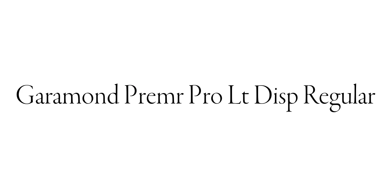
| Font Name | Garamond Premr Pro Lt Disp |
| Style | Regular |
| Category | Serif |
| Designer | Robert Slimbach |
| Copyright | © 2005 Adobe Systems Incorporated. All Rights Reserved. |
| License | Commercial / Paid License |
| Total Character | 2372 |
| Recommended Line Height | 1.16 |
| Ascent | 849 |
| Descent | 309 |
| Units Per em | 1000 |
| Total Vertical Range | 1158 |
| Max Advance Width | 1293 |
| Max Advance Height | N/A |
| Underline Position | -75 |
| Similar Fonts | Adobe Garamond Pro, Sabon, EB Garamond, Minion Pro |
Garamond Premier Pro is the culmination of years of research and design by Robert Slimbach for Adobe. Based on the historic specimens held at the Museum Plantin-Moretus, this typeface is a faithful digital revival of the 16th-century designs of Claude Garamond and Robert Granjon. It captures the humanistic warmth and refined elegance of the French Renaissance period while incorporating modern OpenType features for contemporary workflows.
The Lt Disp (Light Display) version is specifically engineered for large-scale application, such as headlines and titles. Unlike text weights, the Display optical size features higher contrast between thick and thin strokes and more delicate serifs, ensuring that the typeface remains sophisticated and sharp at large point sizes. This specific weight offers a graceful, airy aesthetic perfect for premium editorial design.
Perfect for sophisticated, large-scale titles in magazines and books.
Ideal for luxury brands and high-end corporate identity projects.
Excellent for mastheads, pull quotes, and premium print layouts.
Highly suitable for luxury product labels and high-end cosmetics packaging.

Package Size: 331.0 KB
Available Formats: .OTF
Designed by Designova
Designed by Pradipta Creative

Designed by VP Creative Shop
Designed by Yai Salinas