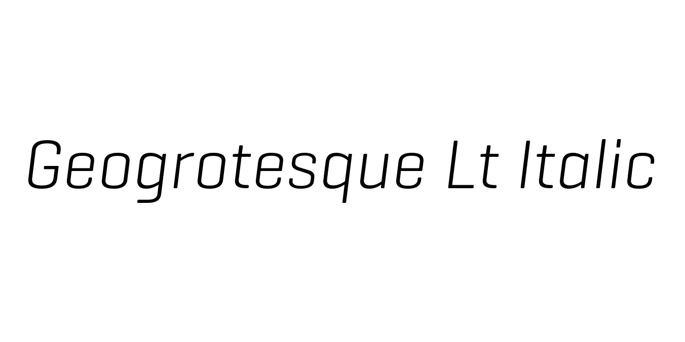
Geogrotesque Lt Italic
Designed by Eduardo Manso
| Font Name | Geogrotesque TRIAL Lt |
| Style | Italic |
| Category | Sans Serif |
| Designer | Eduardo Manso |
| Copyright | Copyright (c) 2008-2016 by Eduardo Manso. All rights reserved. |
| License | Demo / Paid |
| Total Character | 67 |
| Recommended Line Height | 1.3 |
| Ascent | 1000 |
| Descent | 300 |
| Units Per em | 1000 |
| Total Vertical Range | 1300 |
| Max Advance Width | 824 |
| Max Advance Height | N/A |
| Underline Position | -107 |
| Similar Fonts | DIN Next, Eurostile, Titillium Web, Sofia Pro |
Geogrotesque Lt Italic Font Details : Font Free Download
Geogrotesque Lt Italic is a sophisticated semi-modular typeface designed by Eduardo Manso and released through Emtype Foundry. Characterized by its subtle rounded corners and geometric construction, this font strikes a perfect balance between mechanical precision and organic warmth. The Light Italic variant provides a sleek, modern aesthetic that is particularly effective in professional and technological contexts, offering a refined slant that maintains the structural integrity of the original design.
As part of the broader Geogrotesque family, this weight is highly versatile and maintains exceptional legibility across various digital and print platforms. Its design language is inspired by architectural forms and industrial design, making it a favorite for corporate branding, digital interfaces, and editorial layouts. The slanted style provides an elegant emphasis that integrates seamlessly with its upright counterparts, making it an essential tool for designers seeking a clean, contemporary look.
Geogrotesque Lt Italic Best Uses
Perfect for tech-focused brand identities and corporate logos seeking a forward-thinking vibe.
Highly legible for user interfaces, mobile apps, and digital navigation menus.
Suitable for subheadings and pull quotes in architectural and design-centric magazines.
Geogrotesque Lt Italic Glyphs

Download Font
Package Size: 20.9 KB
Available Formats: .OTF