Geogrotesque Rg Regular
Designed by Eduardo Manso
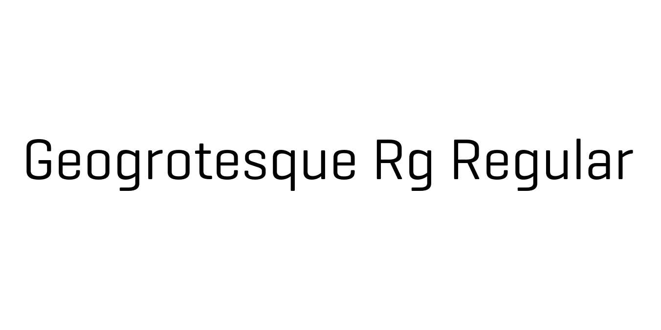
| Font Name | Geogrotesque TRIAL Rg |
| Style | Regular |
| Category | Sans Serif |
| Designer | Eduardo Manso |
| Copyright | Copyright (c) 2008-2016 by Eduardo Manso. All rights reserved. |
| License | Commercial License Required |
| Total Character | 68 |
| Recommended Line Height | 1.3 |
| Ascent | 1000 |
| Descent | 300 |
| Units Per em | 1000 |
| Total Vertical Range | 1300 |
| Max Advance Width | 826 |
| Max Advance Height | N/A |
| Underline Position | -102 |
| Similar Fonts | DIN, Eurostile, Gotham, Barlow, Helvetica |
Geogrotesque Rg Regular Font Details : Font Free Download
Geogrotesque is a semi-modular sans-serif typeface designed by Eduardo Manso and released through the Emtype Foundry in 2006. The typeface is characterized by its geometric construction and subtly rounded corners, which provide a softened, approachable feel to its otherwise rigid, technical structure. This balance makes it a versatile choice for designers looking for a font that feels both precise and human.
The Rg Regular weight serves as the core of the extensive Geogrotesque family, which spans from Thin to Ultra weights. Its high x-height and open apertures ensure excellent legibility across various mediums, making it a staple in contemporary editorial design, corporate branding, and sophisticated user interface projects. It has since become one of the most recognizable geometric-rounded typefaces in the modern design landscape.
Geogrotesque Rg Regular Best Uses
Perfect for creating modern and tech-oriented corporate identities.
Highly effective for headlines, subheadings, and magazine layouts.
Clean and legible, making it suitable for high-end web and mobile interfaces.
Great for posters and marketing materials that require a clean, contemporary look.
Geogrotesque Rg Regular Glyphs
