Arial Narrow Gras
Condensed Neo-Grotesque Sans SerifDesigned by Robin Nicholas and Patricia Saunders
Designed by Matthew Carter
| Font Name | Georgia |
| Style | Gras |
| Category | Serif |
| Designer | Matthew Carter |
| Copyright | © 2016 Microsoft Corporation. All Rights Reserved. |
| License | Free for Personal Use |
| Total Character | 620 |
| Recommended Line Height | 1.14 |
| Ascent | 1878 |
| Descent | 449 |
| Units Per em | 2048 |
| Total Vertical Range | 2327 |
| Max Advance Width | 2777 |
| Max Advance Height | N/A |
| Underline Position | -180 |
| Similar Fonts | Miller, Times New Roman, Palatino |
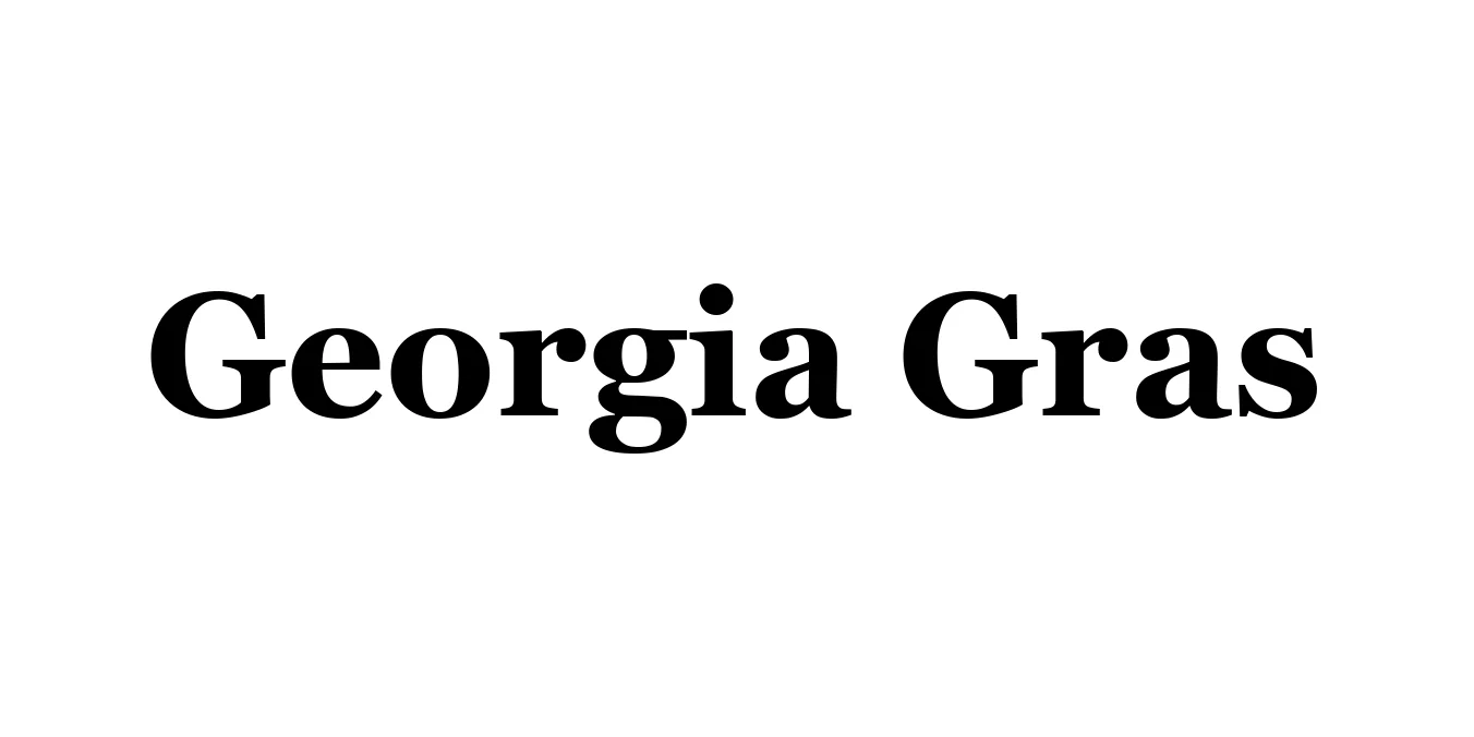
Georgia Gras (the bold weight of the Georgia typeface) was designed in 1993 by the renowned type designer Matthew Carter for Microsoft Corporation. It was specifically engineered to address the challenges of early digital displays, offering exceptional legibility at small sizes on low-resolution screens. Unlike traditional serif fonts of the era, Georgia features a generous x-height and open apertures, ensuring that characters remain distinct and readable even in dense blocks of text.
The Gras variant provides a robust and authoritative presence, maintaining the sophisticated charm of the original family while offering the necessary weight for headlines and emphasis. Characterized by its sturdy serifs and signature old-style numerals, Georgia has transitioned from a "web-safe" staple to a versatile classic used in high-end editorial design and modern digital interfaces alike.
Optimized for screen readability, making it perfect for body copy and headlines on websites.
Excellent for long-form reading in digital magazines and eBooks.
Provides a sense of reliability and tradition for corporate identities.
Large x-height and clear forms make it suitable for users with visual impairments.

Package Size: 202.6 KB
Available Formats: .TTF
Designed by Robin Nicholas and Patricia Saunders
Designed by Robin Nicholas, Patricia Saunders