Sparkasse Light Italic
Sans SerifDesigned by Dalton Maag

Designed by Matthew Carter
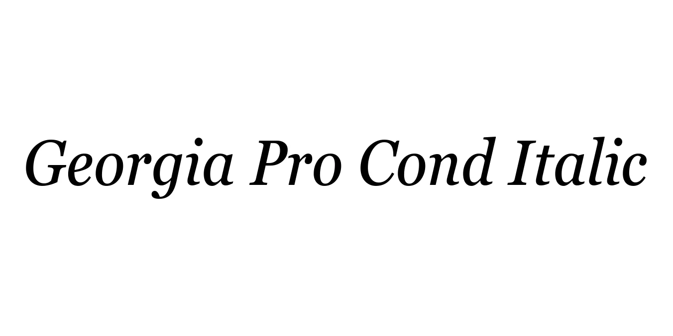
| Font Name | Georgia Pro Cond |
| Style | Italic |
| Category | Serif |
| Designer | Matthew Carter |
| Copyright | © 2018 Microsoft Corporation. All Rights Reserved. |
| License | Commercial License Required |
| Total Character | 724 |
| Recommended Line Height | 1.14 |
| Ascent | 1878 |
| Descent | 449 |
| Units Per em | 2048 |
| Total Vertical Range | 2327 |
| Max Advance Width | 2337 |
| Max Advance Height | N/A |
| Underline Position | -183 |
| Similar Fonts | Times New Roman, Miller, Century Schoolbook, Plantin |
Georgia Pro Cond Italic is an elegant expansion of the original Georgia typeface, which was originally crafted by Matthew Carter in the mid-1990s for Microsoft. This condensed italic version was refined to offer a more slender, space-efficient profile while retaining the high x-height and exceptional legibility that made the family a gold standard for digital screen display.
As part of the Pro series, this variant includes specialized typographic features and a rhythmic slant that brings a professional, editorial feel to narrow text blocks. It bridges the gap between classic transitional serifs and modern digital demands, making it a favorite for designers who need sophisticated typography within tight layout constraints.
Perfect for magazine columns, sidebars, and narrow print layouts.
Optimized for long-form reading on mobile devices and digital screens.
Excellent for formal reports, white papers, and sophisticated stationery.
Adds a refined touch to posters, flyers, and promotional graphics.

Package Size: 152.1 KB
Available Formats: .TTF
Designed by Dalton Maag
Designed by Steve Matteson

Designed by Matthew Carter, Steve Matteson

Designed by Matthew Carter