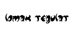
Lomax Regular
Sans SerifDesigned by Alan Meeks
Designed by Matthew Carter, Steve Matteson

| Font Name | Georgia Pro |
| Style | Regular |
| Category | Serif |
| Designer | Matthew Carter, Steve Matteson |
| Copyright | © 2018 Microsoft Corporation. All Rights Reserved. |
| License | Commercial License Required |
| Total Character | 724 |
| Recommended Line Height | 1.14 |
| Ascent | 1878 |
| Descent | 449 |
| Units Per em | 2048 |
| Total Vertical Range | 2327 |
| Max Advance Width | 2501 |
| Max Advance Height | N/A |
| Underline Position | -181 |
| Similar Fonts | Miller, Charter, Times New Roman, Ibarra Real Nova |
Georgia Pro Regular is an extensive evolution of the classic Georgia typeface, originally designed by Matthew Carter for Microsoft. While the original was crafted specifically for legibility on low-resolution screens in the mid-1990s, the Pro version was expanded by Steve Matteson and the Monotype team to include a wider array of weights, specialized typographic features, and refined spacing. It maintains the characteristic high x-height and open counters that made its predecessor a staple of web typography.
This professional iteration brings modern sophistication to a beloved design, offering enhanced character sets including small caps and multiple numeral styles. Georgia Pro Regular excels in both digital and print environments, bridging the gap between traditional serif elegance and the demands of high-density displays. Its sturdy construction ensures that text remains clear and authoritative, making it one of the most reliable serif choices for professional communication today.
Optimized for long-form reading in digital articles and printed books.
Ideal for online news portals and high-end magazine layouts.
Perfect for professional reports, whitepapers, and official documentation.

Designed by Alan Meeks
Designed by Besarion Paata Gugushvili (BPG InfoTech)

Designed by Dan Cassaro

Designed by Catur Argi