Iota Bold
Sans-SerifDesigned by Dalton Maag

Designed by Eric Gill, George Ryan
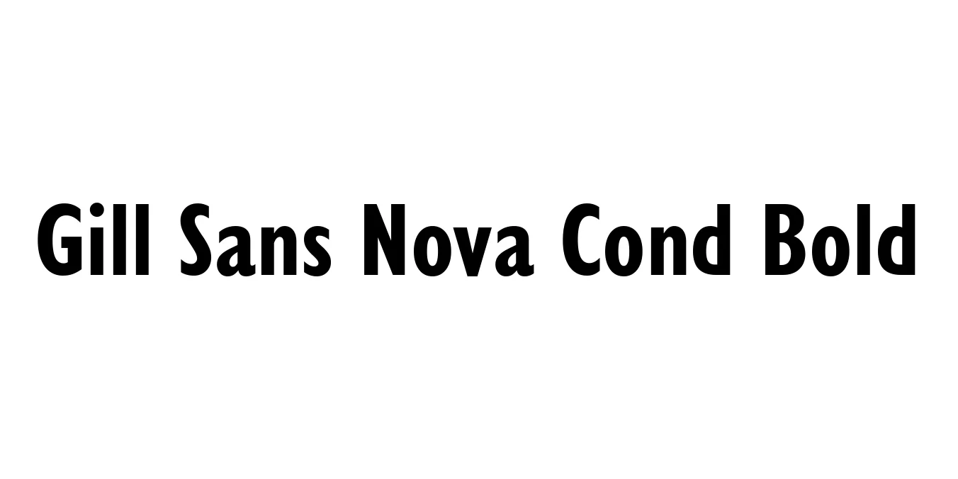
| Font Name | Gill Sans Nova Cond |
| Style | Bold |
| Category | Humanist Sans Serif |
| Designer | Eric Gill, George Ryan |
| Copyright | © 2014 The Monotype Corporation. All Rights Reserved. |
| License | Commercial License |
| Total Character | 509 |
| Recommended Line Height | 1.3 |
| Ascent | 2054 |
| Descent | 612 |
| Units Per em | 2048 |
| Total Vertical Range | 2666 |
| Max Advance Width | 2146 |
| Max Advance Height | N/A |
| Underline Position | -154 |
| Similar Fonts | Johnston, Granby, Cabin, P22 Underground |
Gill Sans Nova Cond Bold is a modern refinement and expansion of the legendary Gill Sans family, originally designed by Eric Gill in 1928. This specific variant was remastered by George Ryan for Monotype to meet the demands of contemporary digital environments while maintaining the typeface's distinct 'humanist' characteristics. It retains the British aesthetic and stone-carved influences that made the original a staple of mid-century design, but offers a significantly more space-efficient profile through its condensed width.
The Bold Condensed weight is particularly prized for its ability to deliver high-impact messaging without requiring excessive horizontal space. Unlike geometric sans-serifs, it features subtle variations in stroke weight and classical proportions that enhance legibility and impart a sense of warmth and authority. It is an ideal choice for editorial layouts, corporate branding, and signage that requires a sophisticated yet approachable voice.
Perfect for striking headlines in magazines and newspapers where space is constrained.
Ideal for logos and branding that aim to project heritage and modernity simultaneously.
Excellent for impactful posters, billboards, and social media graphics.
Highly legible for wayfinding and architectural lettering in narrow environments.

Designed by Dalton Maag
Designed by Eric Gill, George Ryan
Designed by VP Creative Shop
Designed by Monotype Design Studio