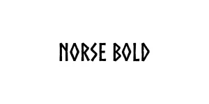
Norse Bold
Display / DecorativeDesigned by Joël Carrouché
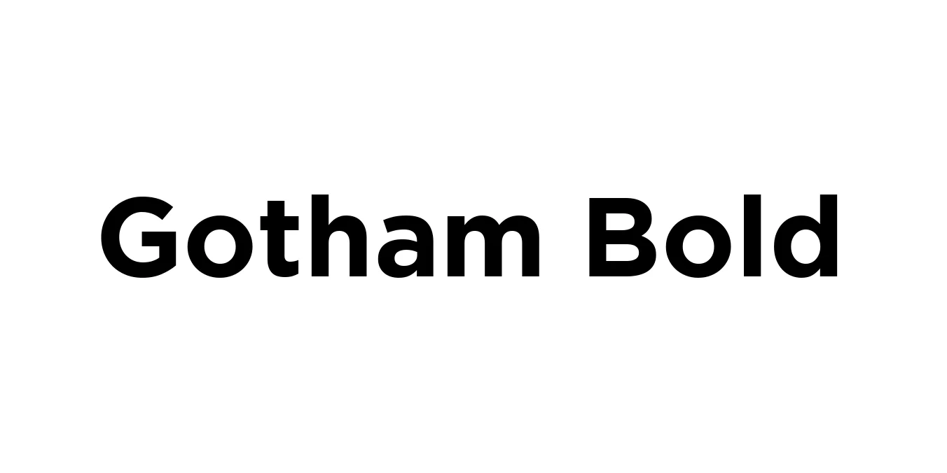
Designed by Tobias Frere-Jones
| Font Name | Gotham |
| Style | Bold |
| Category | Sans Serif |
| Designer | Tobias Frere-Jones |
| Copyright | HTF Gothamᆰ Copr. 2000 The Hoefler Type Foundry, Inc. Info: www.typography.com |
| License | Commercial license required |
| Total Character | 225 |
| Recommended Line Height | 1.11 |
| Ascent | 932 |
| Descent | 173 |
| Units Per em | 1000 |
| Total Vertical Range | 1105 |
| Max Advance Width | 1240 |
| Max Advance Height | N/A |
| Underline Position | -133 |
| Similar Fonts | Montserrat, Proxima Nova, Avenir, Museo Sans |
Gotham is a geometric sans-serif typeface family designed by American type designer Tobias Frere-Jones in 2000. Originally commissioned by GQ magazine, the font was intended to capture a masculine, new, and fresh aesthetic that moved away from the more traditional Swiss designs. The letterforms are inspired by the architectural signage and basic building lettering found throughout mid-twentieth century New York City, particularly in the Port Authority Bus Terminal.
The typeface rose to global prominence after being selected for the 2008 Barack Obama presidential campaign, where its clean, authoritative, and modern look became synonymous with the message of change. Gotham Bold, in particular, offers a powerful weight that maintains exceptional clarity and balance, making it one of the most versatile and influential typefaces of the 21st century.
Ideal for high-end corporate identities and professional logo design.
Perfect for clean, authoritative, and impactful messaging.
Excellent for magazine headlines and heavy-impact cover titles.
Great for bold UI elements, navigation menus, and hero section headings.

Designed by Joël Carrouché
Designed by Antonio Rodrigues Jr.