SansSerifBldFLF-Italic Italic
Sans SerifDesigned by Michael Hagemann
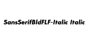
Designed by Tobias Frere-Jones
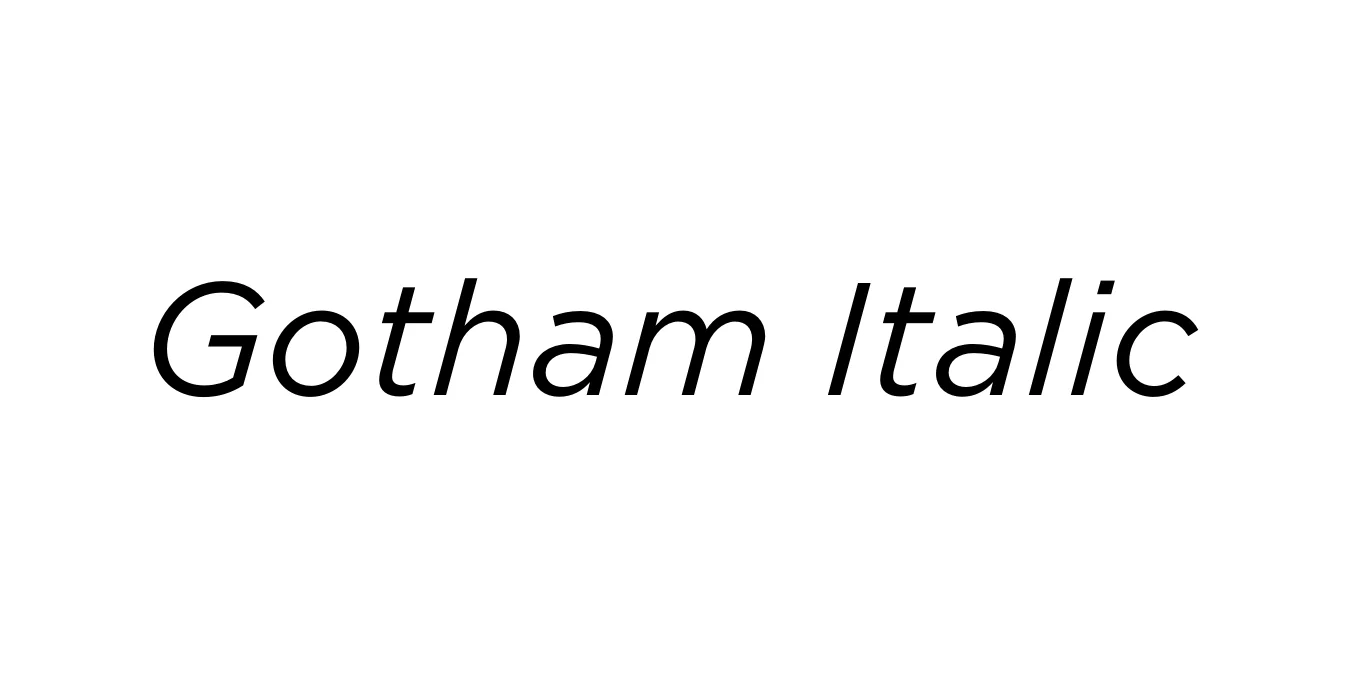
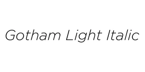
| Font Name | Gotham |
| Style | Italic |
| Category | Geometric Sans Serif |
| Designer | Tobias Frere-Jones |
| Copyright | HTF Gotham Copr. 2002 The Hoefler Type Foundry, Inc. Info: www.typography.com |
| License | Commercial License Required |
| Total Character | 223 |
| Recommended Line Height | 1.11 |
| Ascent | 907 |
| Descent | 200 |
| Units Per em | 1000 |
| Total Vertical Range | 1107 |
| Max Advance Width | 1226 |
| Max Advance Height | N/A |
| Underline Position | -123 |
| Similar Fonts | Montserrat, Proxima Nova, Avenir, Museo Sans |
Gotham was originally commissioned by GQ magazine and designed by Tobias Frere-Jones in 2000. The font was inspired by the non-typographic architectural signage found throughout New York City, particularly the lettering on the Port Authority Bus Terminal. This geometric sans-serif captures the spirit of mid-century American design, offering a clean, authoritative, and timeless aesthetic that feels both modern and nostalgic.
The Gotham Italic weight provides a sophisticated slant to the original geometric structure, enhancing its versatility for professional layouts. It achieved global recognition through its prominent use in the 2008 Barack Obama presidential campaign, which cemented its status as a contemporary classic. Today, it is a staple for designers looking for a balance of clarity, strength, and elegance across both print and digital media.
Ideal for creating strong and trustworthy corporate identities and logos.
Great for high-impact headlines and commercial promotional graphics.
Ensures excellent readability for modern user interfaces and headings.
Perfect for editorial layouts, magazines, and professional reports.

Package Size: 22.0 KB
Available Formats: .OTF
Designed by Michael Hagemann
Designed by Tobias Frere-Jones
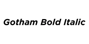
Designed by Tobias Frere-Jones
Designed by Tobias Frere-Jones