Gotham Light
Designed by Tobias Frere-Jones
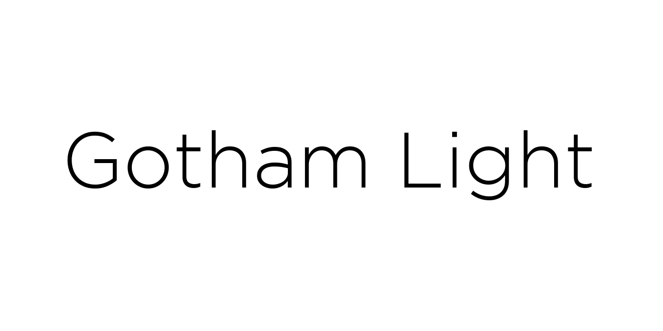
| Font Name | Gotham |
| Style | Light |
| Category | Geometric Sans-Serif |
| Designer | Tobias Frere-Jones |
| Copyright | HTF Gotham\252 Copr. 2000 The Hoefler Type Foundry, Inc. Info: www.typography.com |
| License | Personal Use Only / Demo |
| Total Character | 225 |
| Recommended Line Height | 1.06 |
| Ascent | 898 |
| Descent | 163 |
| Units Per em | 1000 |
| Total Vertical Range | 1061 |
| Max Advance Width | 1200 |
| Max Advance Height | N/A |
| Underline Position | -133 |
| Similar Fonts | Montserrat, Proxima Nova, Avenir |
Gotham Light Font Details : Font Free Download
Gotham Light is a contemporary geometric sans-serif typeface designed by Tobias Frere-Jones in 2000. Originally commissioned by GQ magazine, the font was inspired by the architectural lettering found on mid-20th-century buildings in New York City, particularly the signage at the Port Authority Bus Terminal. This foundation gives the font a distinctly American, "no-nonsense" feel that is both honest and professional.
The Light weight of the Gotham family is celebrated for its clarity and sophisticated air. It gained international prominence during the 2008 Obama presidential campaign, where its clean lines helped project a modern and hopeful image. Today, it remains a staple for designers seeking a typeface that combines historical architectural roots with a sleek, minimalist aesthetic suitable for high-end digital and print media.
Gotham Light Best Uses
Ideal for clean, high-end landing pages and minimalist user interfaces.
Perfect for sophisticated corporate identities and luxury brand logos.
Excellent for fashion magazines and high-style print publication layouts.
Gotham Light Glyphs

Download Font
Package Size: 55.2 KB
Available Formats: .TTF