Gotham Medium
Designed by Tobias Frere-Jones
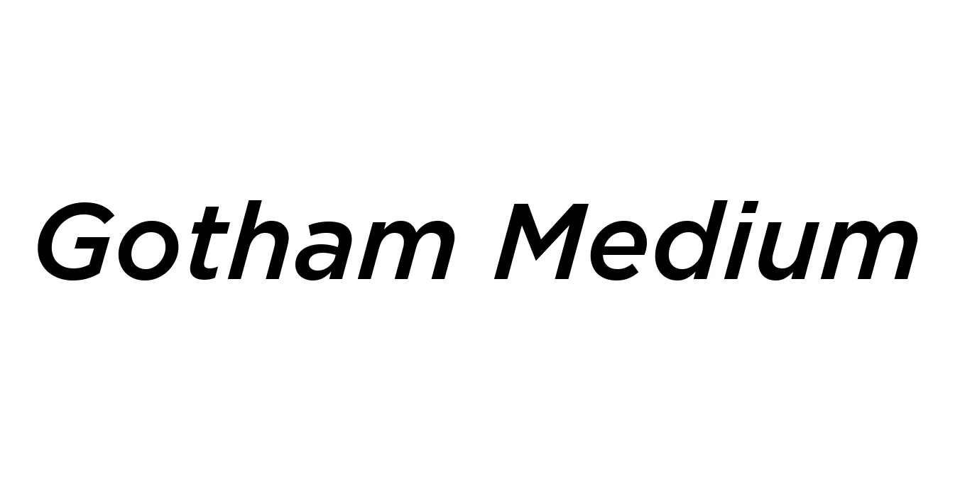
| Font Name | Gotham |
| Style | Medium |
| Category | Sans Serif |
| Designer | Tobias Frere-Jones |
| Copyright | HTF Gotham\252 Copr. 2002 The Hoefler Type Foundry, Inc. Info: www.typography.com |
| License | Free for Personal Use |
| Total Character | 225 |
| Recommended Line Height | 1.12 |
| Ascent | 922 |
| Descent | 200 |
| Units Per em | 1000 |
| Total Vertical Range | 1122 |
| Max Advance Width | 1262 |
| Max Advance Height | N/A |
| Underline Position | -133 |
| Similar Fonts | Montserrat, Proxima Nova, Avenir, Museo Sans |
Gotham Medium Font Details : Font Free Download
Gotham Medium is a geometric sans-serif typeface family designed by American type designer Tobias Frere-Jones in 2000. Originally commissioned by GQ magazine, the designers sought a typeface that would feel fresh, masculine, and inherently American. It was heavily inspired by the non-proportional, architectural lettering found on signage at the Port Authority Bus Terminal and other urban elements throughout 20th-century New York City, moving away from traditional Swiss or German geometric models.
Since its public release, Gotham has ascended to become one of the most recognizable typefaces of the modern era. It achieved massive cultural visibility through its use in Barack Obama's 2008 presidential campaign, symbolizing hope and change. The Medium weight is particularly favored for its exceptional balance between stroke thickness and negative space, making it a versatile choice for everything from high-end corporate identities to sophisticated digital interfaces.
Gotham Medium Best Uses
Ideal for logos and visual identities that require a sense of authority and modernity.
Excellent for magazine headlines and sophisticated layout design.
Provides clean legibility for hero sections, navigation bars, and call-to-action buttons.
Famous for high-visibility public messaging and impactful campaign slogans.
Gotham Medium Glyphs

Download Font
Package Size: 53.2 KB
Available Formats: .TTF