Gotham Narrow Black Regular
Designed by Tobias Frere-Jones
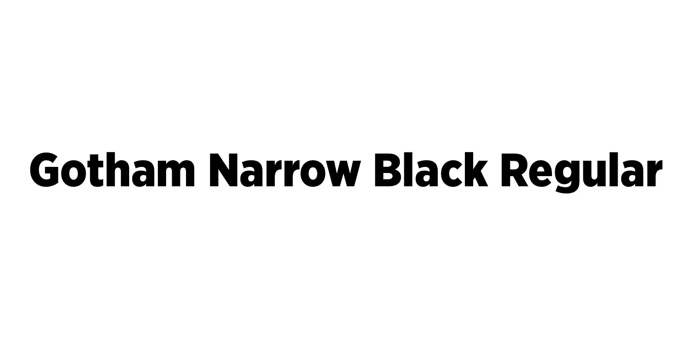
| Font Name | Gotham Narrow Black |
| Style | Regular |
| Category | Sans Serif |
| Designer | Tobias Frere-Jones |
| Copyright | Copyright (C) 2001, 2008 Hoefler & Frere-Jones. http://www.typography.com |
| License | Commercial License Required |
| Total Character | 342 |
| Recommended Line Height | 1.2 |
| Ascent | 960 |
| Descent | 240 |
| Units Per em | 1000 |
| Total Vertical Range | 1200 |
| Max Advance Width | 1151 |
| Max Advance Height | N/A |
| Underline Position | -75 |
| Similar Fonts | Montserrat, Proxima Nova, Raleway, Effra |
Gotham Narrow Black Regular Font Details : Font Free Download
Gotham Narrow Black Regular is a specialized weight within the broader Gotham family, designed by Tobias Frere-Jones. Inspired by the architectural signage found throughout mid-century New York City, the Gotham family was originally commissioned by GQ magazine. It has since evolved into one of the most recognizable and widely used geometric sans-serif typefaces of the 21st century, celebrated for its honest, professional, and authoritative tone.
The Narrow variant was specifically developed to offer a more space-efficient solution compared to the standard width, making it ideal for tight layouts where visual impact remains a priority. In its Black weight, the font provides maximum density and weight, ensuring that headlines and branding elements stand out with a sense of modern sophistication and structural integrity.
Gotham Narrow Black Regular Best Uses
Ideal for high-impact, space-saving titles in magazines and editorial layouts.
Perfect for creating strong, authoritative logos and corporate identities.
Great for bold typographic posters that require a heavy visual weight.
Excellent for hero sections and navigation menus needing high legibility in restricted space.
Gotham Narrow Black Regular Glyphs

Download Font
Package Size: 153.4 KB
Available Formats: .OTF