Gotham Narrow Light Italic
Designed by Tobias Frere-Jones
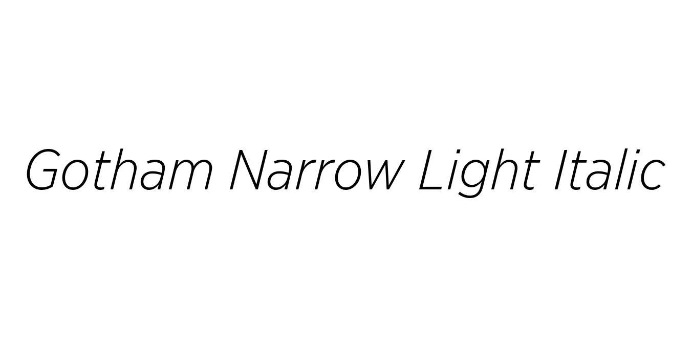
| Font Name | Gotham Narrow Light |
| Style | Italic |
| Category | Sans Serif |
| Designer | Tobias Frere-Jones |
| Copyright | Copyright (C) 2005, 2008 Hoefler & Frere-Jones. http://www.typography.com |
| License | Commercial License Required |
| Total Character | 387 |
| Recommended Line Height | 1.2 |
| Ascent | 960 |
| Descent | 240 |
| Units Per em | 1000 |
| Total Vertical Range | 1200 |
| Max Advance Width | 1065 |
| Max Advance Height | N/A |
| Underline Position | -75 |
| Similar Fonts | Montserrat, Proxima Nova, Avenir, Museo Sans |
Gotham Narrow Light Italic Font Details : Font Free Download
Gotham Narrow Light Italic is a refined extension of the iconic Gotham family, originally inspired by the architectural signage of mid-20th century New York City. Designed by Tobias Frere-Jones, the Narrow variant was specifically engineered for space-constrained environments where the expansive width of the original Gotham might be impractical. It maintains the honest, geometric integrity and no-nonsense character of its predecessor while offering a more compact horizontal footprint.
The Light Italic weight brings a sense of sophisticated movement and elegance to the typeface. It is characterized by its precise stroke weights and mathematical curves, making it an excellent choice for high-end editorial work, professional subheadings, and contemporary branding. This font bridges the gap between utilitarian efficiency and modern aesthetic grace, ensuring legibility and style across both digital and print mediums.
Gotham Narrow Light Italic Best Uses
Ideal for elegant pull quotes and sophisticated magazine subheadings.
Perfect for professional business reports and whitepapers requiring a modern look.
Excellent for sidebars and navigation menus where horizontal space is at a premium.
Gotham Narrow Light Italic Glyphs

Download Font
Package Size: 192.5 KB
Available Formats: .OTF